Interactive and Reproducible Workflows for Exploring and Modeling RNA-seq Data with pcaExplorer, Ideal, and GeneTonic
Annekathrin Ludt, Annekathrin Ludt, Arsenij Ustjanzew, Arsenij Ustjanzew, Harald Binder, Harald Binder, Konstantin Strauch, Konstantin Strauch, Federico Marini, Federico Marini
data visualization
functional interpretation
interactive data analysis
reproducible research
RNA-seq
Abstract
The generation and interpretation of results from transcriptome profiling experiments via RNA sequencing (RNA-seq) can be a complex task. While raw data quality control, alignment, and quantification can be streamlined via efficient algorithms that can deliver the preprocessed expression matrix, a common bottleneck in the analysis of such large datasets is the subsequent in-depth, iterative processes of data exploration, statistical testing, visualization, and interpretation. Specific tools for these workflow steps are available but require a level of technical expertise which might be prohibitive for life and clinical scientists, who are left with essential pieces of information distributed among different tabular and list formats.
Our protocols are centered on the joint use of our Bioconductor packages (pcaExplorer, ideal, GeneTonic) for interactive and reproducible workflows. All our packages provide an interactive and accessible experience via Shiny web applications, while still documenting the steps performed with RMarkdown as a framework to guarantee the reproducibility of the analyses, reducing the overall time to generate insights from the data at hand.
These protocols guide readers through the essential steps of Exploratory Data Analysis, statistical testing, and functional enrichment analyses, followed by integration and contextualization of results. In our packages, the core elements are linked together in interactive widgets that make drill-down tasks efficient by viewing the data at a level of increased detail. Thanks to their interoperability with essential classes and gold-standard pipelines implemented in the open-source Bioconductor project and community, these protocols will permit complex tasks in RNA-seq data analysis, combining interactivity and reproducibility for following modern best scientific practices and helping to streamline the discovery process for transcriptome data. © 2022 The Authors. Current Protocols published by Wiley Periodicals LLC.
Basic Protocol 1 : Exploratory Data Analysis with pcaExplorer
Basic Protocol 2 : Differential Expression Analysis with ideal
Basic Protocol 3 : Interpretation of RNA-seq results with GeneTonic
Support Protocol : Downloading and installing pcaExplorer, ideal, and GeneTonic
Alternate Protocol : Using functions from pcaExplorer, ideal, and GeneTonic in custom analyses
INTRODUCTION
Gene expression is a fundamental biological process, resulting from various genetic and regulatory programs that define the state of cells and tissues, and can be measured with a variety of experimental techniques. RNA sequencing (RNA-seq) is a widely used molecular assay, offering a quantitative and robust system for profiling transcriptional outcomes (Mortazavi, Williams, McCue, Schaeffer, & Wold, 2008; Wang, Gerstein, & Snyder, 2009). Over the years, RNA-seq has replaced microarrays as a technology of choice, and has been adopted in a large number of studies from basic sciences, but has also proven fundamental in clinical settings to better understand development and disease (Salit & Woodcock, 2021; Van den Berge et al., 2019; Zhang et al., 2015).
Currently, RNA-seq enables the study of a multitude of applications, comprising gene expression regulation, isoform and transcript discovery, alternative splicing, gene fusion, genetic variation among expressed genes, RNA editing, post-transcriptional modifications, and epitranscriptomics (Conesa et al., 2016), with many of these applications being increasingly addressed also at the single-cell and at the spatial resolution (Li & Wang, 2021). While powerful tools exist to perform quality control, alignment, and expression quantification, a common bottleneck is constituted by the data exploration, modeling, and interpretation, to be performed once a table of counts (as proxy for the gene expression values) and the full information on the experimental covariates are available (Anders et al., 2013; Soneson, Love, & Robinson, 2015).
Knowledge extraction from transcriptomics datasets, increasingly available in larger and more complex experimental scenarios, can be a time-consuming task, whereas the complementary expertise of data analysts and bench scientists are often required for efficient, comprehensive, and impactful analyses (Akhmedov, Martinelli, Geiger, & Kwee, 2020). This is especially true for differential expression analysis, for which a number of established methods (and their implementation, mostly provided as R packages) exist, but might not be immediate to use for broader audiences, despite valuable efforts in accurately documenting software (Amezquita et al., 2020; Love, Huber, & Anders, 2014; McCarthy, Chen, & Smyth, 2012; Ritchie et al., 2015). In this context, the appropriate setup of the statistical modeling according to the circumstances of their experiment is often best selected with the guidance of a biostatistician/bioinformatician, who usually generates a summary report, to be shared with collaborators afterwards (Soneson, Marini, Geier, Love, & Stadler, 2020). In particular, after the discovery of differentially expressed genes and the identification of the processes that might be underlying these transcriptional changes, the detailed exploration of the complete set of results is an iterative process where the integration of all components might be a prohibitive task for life and clinical scientists (Geistlinger et al., 2020; Marini, Ludt, Linke, & Strauch, 2021; McDermaid, Monier, Zhao, Liu, & Ma, 2018).
The framework we offer provides accessible and user-friendly interfaces, while making sure to document and record the steps performed via companion RMarkdown reports, as a foundation for reproducible research (Marini & Binder, 2016). Overall, our solution serves as a bridge among many researchers, enabling them to adopt state-of-the-art methods from the open-source Bioconductor ecosystem of packages (Amezquita et al., 2020; Huber et al., 2015), with dashboards that can seamlessly be used on desktop/laptop computers, shared, and deployed in collaborative contexts. The core elements of the applications are linked together within the Shiny reactive programming engine, efficiently implementing tasks such as repeated drill-down into the datasets for providing views of increased detail. This, in turn, translates into a reduced time and effort to generate hypotheses and insight from the data at hand, increasing its value and impact by streamlining the discovery process for transcriptomics gene regulation studies (Marini et al., 2021).
In this article, we will demonstrate how to use a series of packages we developed (pcaExplorer, ideal, and GeneTonic, all available through the Bioconductor project (Marini & Binder, 2019; Marini et al., 2021; Marini, Linke, & Binder, 2020), to interactively explore, visualize, and integrate RNA-seq datasets and results. All protocols described in this manuscript can be combined in a single analytic workflow, which can be widely applied to bulk RNA-seq scenarios (including, e.g., patient data in clinical/diagnostic settings), and can be adopted by a broad spectrum of researchers, empowering also users with limited technical/biostatistical expertise.
Basic Protocol 1 describes the essential steps of exploratory data analysis as it is performed using the pcaExplorer package, starting from the essential count matrix generated after expression quantification.
Basic Protocol 2 explains how to perform statistical modeling and testing for differential expression with the ideal package (leveraging the framework of DESeq2), followed by functional enrichment analysis.
Basic Protocol 3 illustrates how to use the GeneTonic package to combine expression data, results from the differential expression analysis, and functional enrichment tabular information to efficiently interpret and contextualize RNA-seq data.
The Support Protocol shows the detailed instructions to download and install all the required software, including the exemplary datasets used throughout this manuscript.
Alternate Protocol describes the usage of functions from pcaExplorer, ideal, and GeneTonic, as they can be seamlessly used in tailored analyses, either as R scripts or as RMarkdown documents.
Notably, each of the Basic Protocols can be executed in a stand-alone manner if other established upstream procedures are already in place.
STRATEGIC PLANNING
Before starting with the Basic Protocols, users should complete the installation of the required software as detailed in the Support Protocol. By following these instructions, all necessary packages and datasets will be made available so that they can be executed from any directory on the local computer. We refer to the software descriptions and vignettes of the individual packages for additional information.
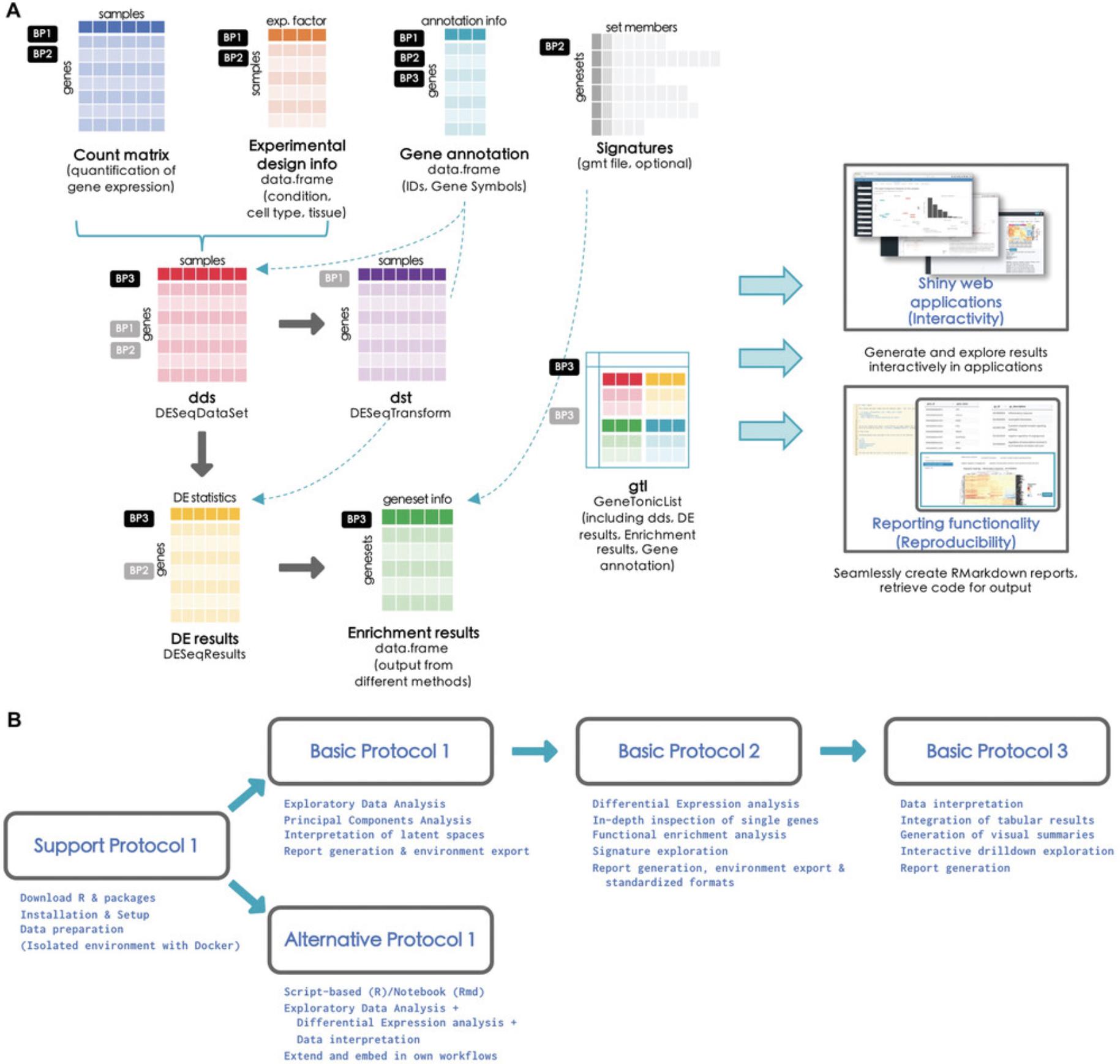
The protocols described in this article represent the main steps through a comprehensive analytic workflow for bulk RNA-seq datasets, and are structured in a modular way that can enable readers to carry them out with the possibility of alternate entry points (e.g., performing differential expression analysis with another software package from the R environment or from the command line). Figure 1 illustrates the different files required to carry out such operations (Fig. 1A), together with an overview of the tasks covered by the software packages we present in this work (Fig. 1B). As shown in the flowchart, it is possible to navigate back to previous steps in different iterations of the analyses. This is intrinsically bound to the explorative nature for such high-dimensional datasets, where cycles of hypothesis generation and testing can follow, ultimately leading to the validation and integration with the additional observations specific to each experimental setting.
In the following protocols, R functions in the text will appear formatted as my_function()/my_parameter, and the same monospace formatting will be used for typed R input commands in the console, and the corresponding output. Occasional comments will be reported in the code chunk, prefaced by the # symbol. Package names will also be reported in monospace font as package_name. The panel components of the web applications will be reported in capitals, as they are specified in their implementation, while buttons and other widgets will be enclosed in single quotes as ‘Button name’.
Basic Protocol 1: EXPLORATORY DATA ANALYSIS WITH pcaExplorer
pcaExplorer is a Bioconductor package (Marini & Binder, 2019) which can be used as a general-purpose interactive companion tool for RNA-seq analyses, developed in the Shiny framework (Chang et al., 2021). pcaExplorer is designed to guide the user in exploring the Principal Components (PC) latent space (Jolliffe, 2002) of the data under inspection. Besides the Principal Component Analysis (PCA), pcaExplorer also provides tools to detect outlier samples and inspect their impact, identify genes that show particular patterns of interest, and additionally provide a functional interpretation of the principal components for further quality assessment and hypothesis generation on the input data.
In this protocol, we describe how to launch an instance of pcaExplorer working with the data of the macrophage dataset (Alasoo et al., 2018), which is also distributed as a Bioconductor package (Huber et al., 2015).
Necessary Resources
Hardware
See detailed description in the Support Protocol
Software
See detailed description in the Support Protocol
Files
- See detailed description in the Support Protocol. Specifically, this Basic Protocol will make use of:
- The count matrix file, containing the expression values for the macrophage dataset (countmatrix_macrophage.txt)
- The file containing the information on the experimental covariates (metadata_macrophage.txt)
- The annotation file (annotation_macrophage.txt), for handling the conversion between ENSEMBL identifiers and gene symbols.
The alternative entry points specified in this Basic Protocol also use some processed form of the text files listed above to generate the dds and dst objects (see step 2 below), ensuring that this procedure is fully reproducible (see Fig. 1A for a visual summary).
NOTE : Before we start with the exploration of the data, the necessary packages and dependencies need to be installed and loaded. The Support Protocol describes how to install and load the packages.
Exploring the data with pcaExplorer
1.Prepare the input data for pcaExplorer.
- library("pcaExplorer")
- pcaExplorer()
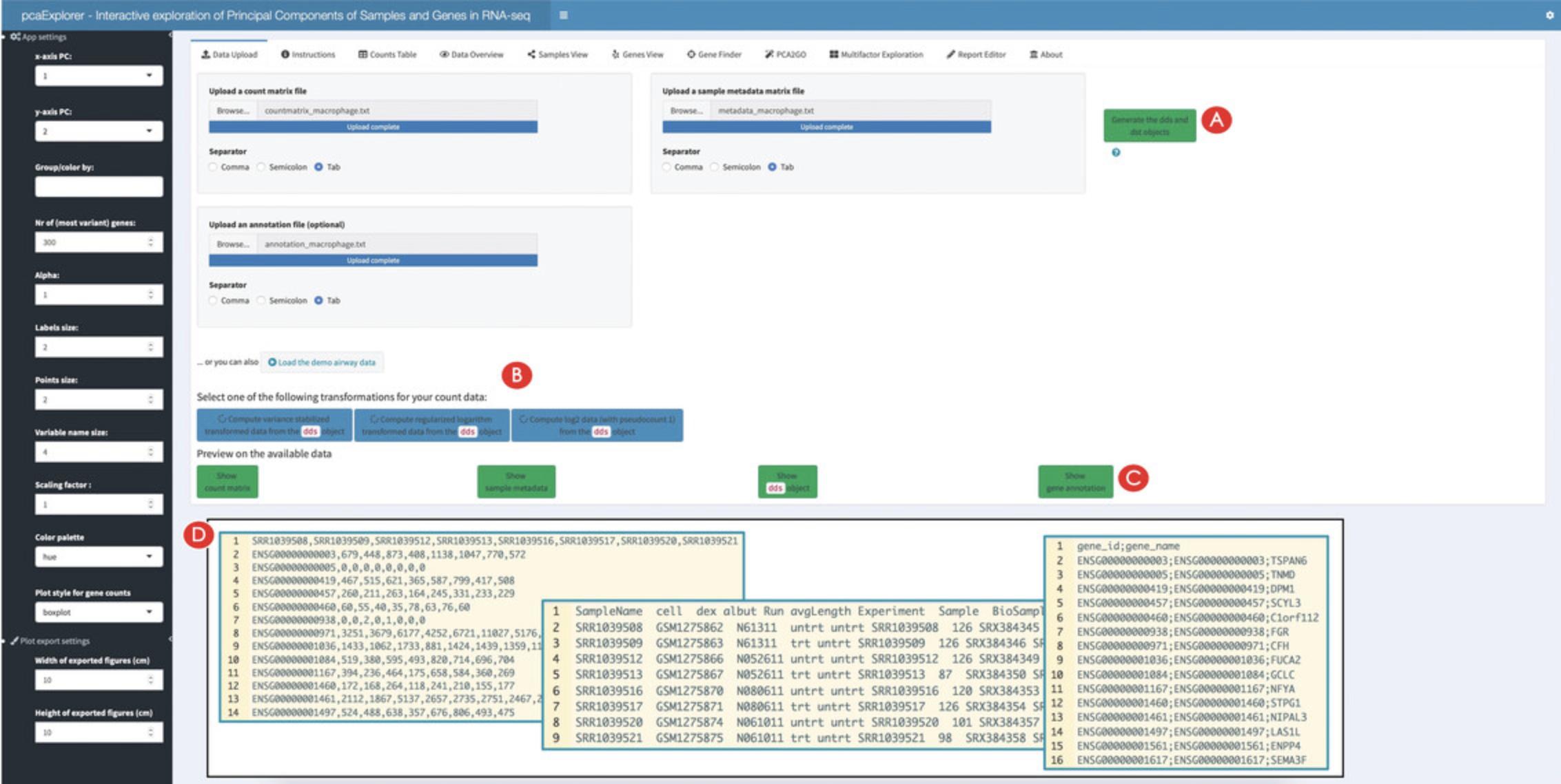
To launch the application, enter the command into the console of RStudio and press the Enter key. This will open a new window with the pcaExplorer application. In this application you should see the Data Upload panel as shown in Figure 2, with examples on the file formats expected to be working correctly in the app (see inset in Fig. 2D).
In this case, upload one by one the count matrix file, the sample metadata file, and the annotation file as provided in the ‘Input_file’ folder of the protocols repository (see Support Protocol) – Figure 2 reflects the content displayed if launching the application as specified above.
If the necessary objects are already loaded in R (e.g., with any function that reads tabular text input), you can launch the Shiny application with the command:
- library("pcaExplorer")
- pcaExplorer(countmatrix = countmatrix,
- coldata = metadata,
- annotation = annotation)
In this call, countmatrix, metadata, and annotation have to be substituted by the names of the respective objects.
2.Generate the necessary objects for using pcaExplorer.
- library("pcaExplorer")
- pcaExplorer(dds = my_dds,
- dst = my_dst)
After the generation of the two objects, the ‘Select one of the following transformations for your data:’ option with three blue colored buttons underneath should appear in the panel. Click the ‘Compute variance stabilized transformed data from the dds object’ button on the left (Fig. 2B).
pcaExplorer provides three different options for data transformation. The first option is to compute a variance-stabilized transformed version of the data. The second is a regularized logarithm transformation of the data. A log2 data transformation is also offered. Users are advised to choose the data transformation according to their input data and evaluate the effects of the different transformations on their data.
3.Preview the provided input data.
4.Explore in detail the provided counts table.
![Details are in the caption following the image Overview of the Counts Table panel in pcaExplorer. The navigation to this panel occurs by clicking on the respective name on the top of the tabs (A). The selection of the displayed expression table is done with the dropdown element (B), and the content of the table can be downloaded by clicking on the download button (C). The correlations between samples can be explored in the section below (D), where additional content can be generated [e.g., a scatter plot matrix and a heatmap, to appear at (E)].](https://static.yanyin.tech/literature_test/cpz1411-fig-0003-m.jpg)
5.Explore the correlations between samples.
Creating an overview and computing summaries on the provided data
6.Explore the relationships between the samples.
7.Decorate the plots by encoding information on the experimental covariates.
8.Change the selected experimental covariates of interest.
9.Compute some summary statistics on the provided data.
Exploring the Principal Components from the samples point of view
10.Create a Principal Component plot.
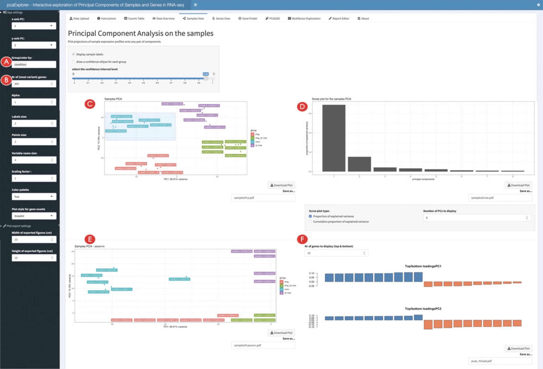
11.Change the parameters to display different versions of the PCA.
12.Zoom in the PCA plot.
13.Identify genes with high loadings on the selected principal components.
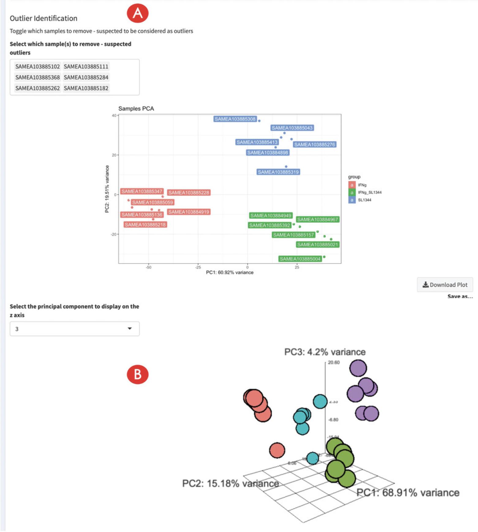
14.Inspect the impact of marking samples as outliers.
Exploring the Principal Components from the genes point of view
15.Create the genes biplot.
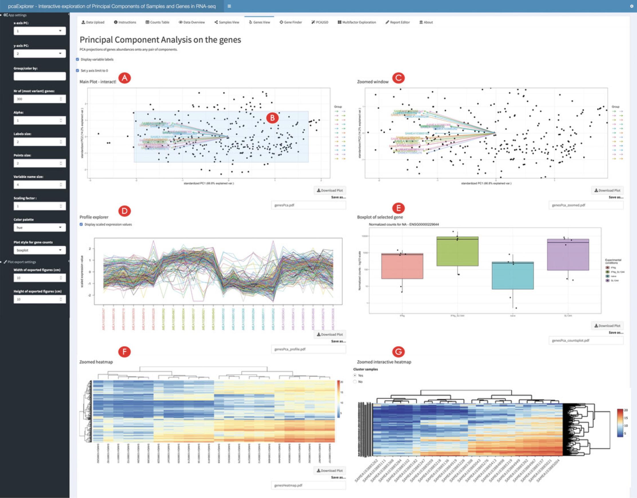
16.Inspect single selected genes.
17.Inspect subsets of selected genes.
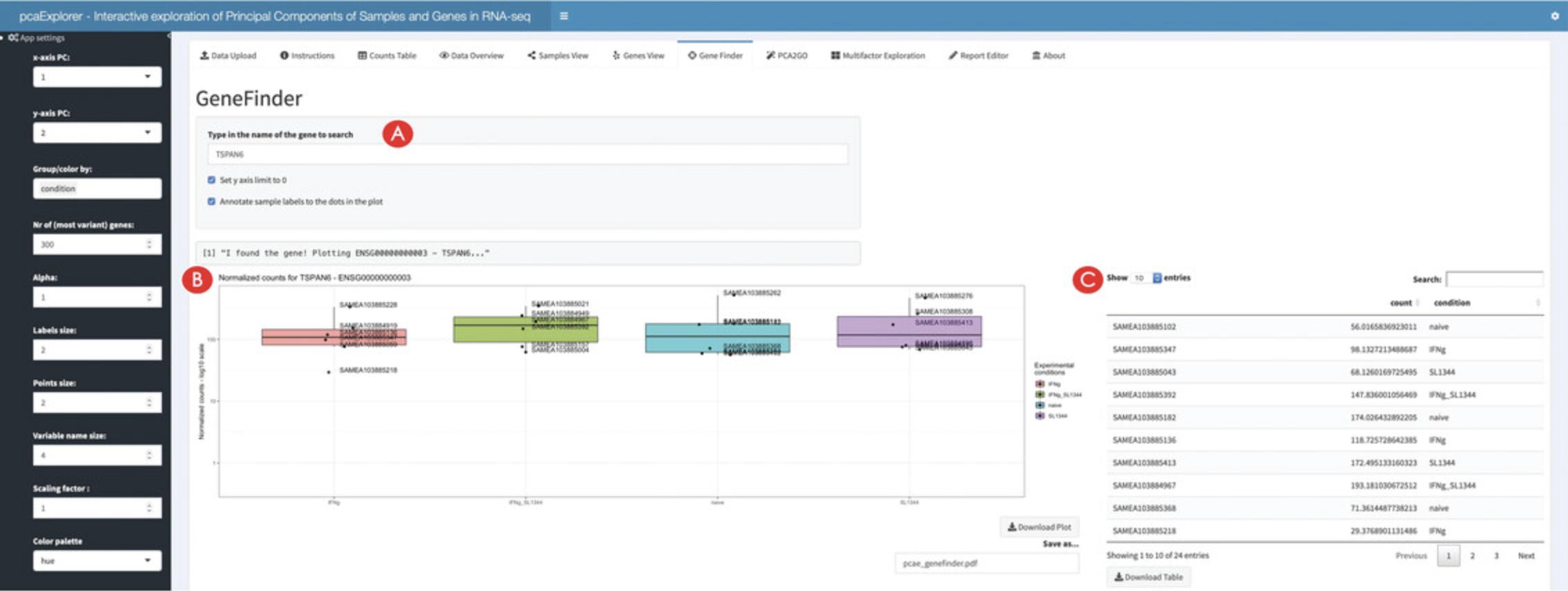
18.Inspect genes of interest in the Gene Finder.
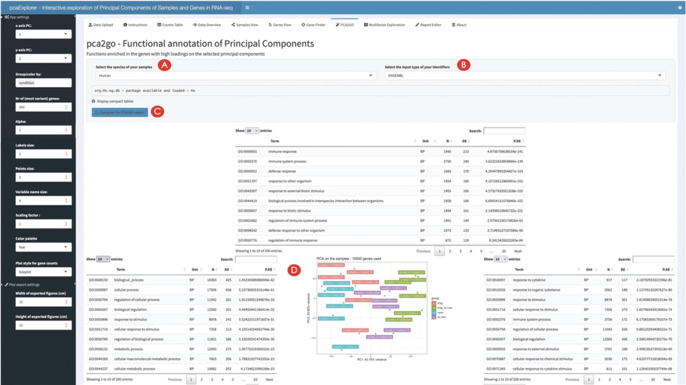
19.Generate a functional interpretation for the principal components.
Wrapping up the analysis with pcaExplorer
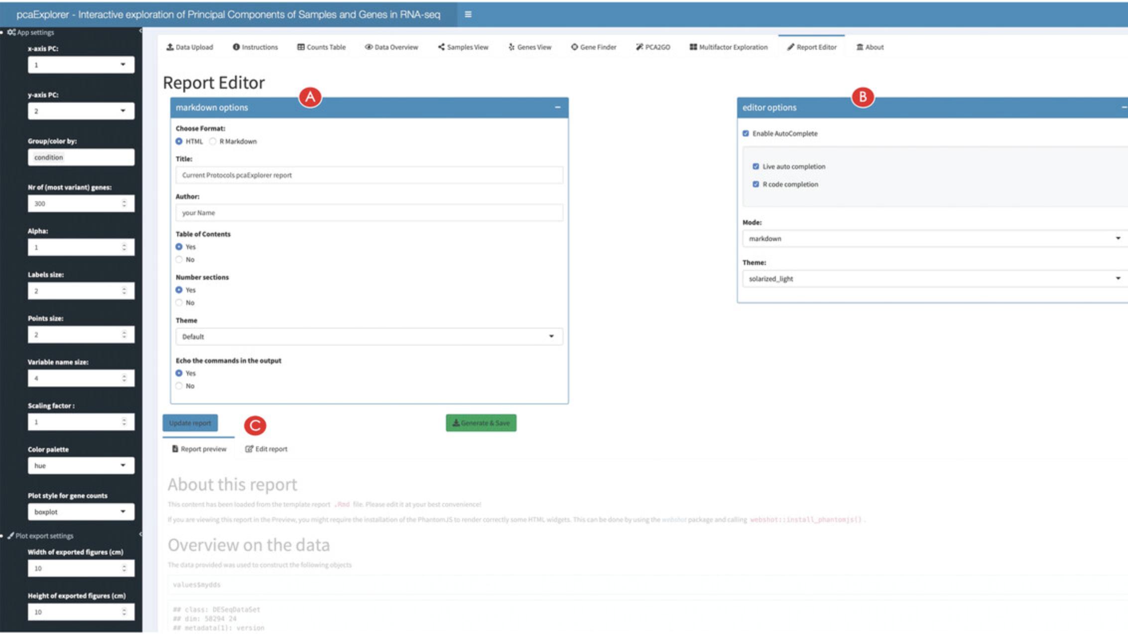
20.Generate, preview, and export an analysis report.
21.Export the analyses components for further downstream exploration.
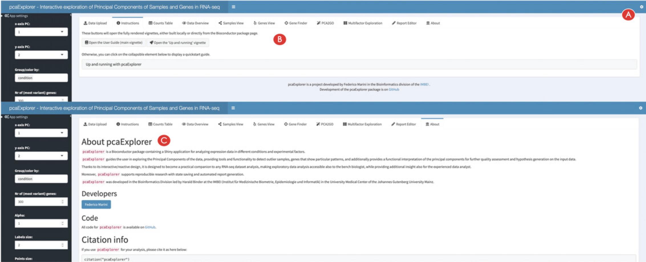
22.Find additional information on pcaExplorer.
Basic Protocol 2: DIFFERENTIAL EXPRESSION ANALYSIS WITH ideal
ideal (Marini et al., 2020) is a Bioconductor package for the interactive analysis of RNA-seq data in the context of differential expression (DE) (Love, Anders, Kim, & Huber, 2015). ideal guides the user through the different steps of a DE analysis, starting from the data upload, through the DESeq2 (Love et al., 2014) workflow including normalization, filtering, exploration of differentially expressed genes, to functional analysis and gene signature exploration.
In this protocol we describe how to launch the ideal web application (also implemented in the Shiny framework (Chang et al., 2021)), running on the macrophage dataset (Alasoo et al., 2018), which is also distributed as a Bioconductor package (Huber et al., 2015).
Necessary Resources
Hardware
See detailed description in Support Protocol.
Software
See detailed description in Support Protocol.
Files
- See detailed description in Support Protocol. Specifically, this Basic Protocol will make use of:
- The count matrix file, containing the expression values for the macrophage dataset (countmatrix_macrophage.txt)
- The file containing the information on the experimental covariates (metadata_macrophage.txt)
- The annotation file (annotation_macrophage.txt), for handling the conversion between ENSEMBL identifiers and gene symbols
- The gene signatures file (h.all.v7.4.symbols.gmt), as it is distributed via the MSigDB collections.
The alternative entry points defined in this Basic Protocol also use some processed form of the text files listed above to generate the dds_obj and res_obj (described in detail in step 1 below), ensuring that this procedure is fully reproducible (see Fig. 1A for a visual summary).
NOTE : Before proceeding with the modeling of the RNA-seq data, the necessary packages and dependencies need to be installed and loaded. The Support Protocol describes how to install and load the packages.
Starting up with the ideal package
1.Load the ideal package and start the ideal web application.
- library("ideal")
- ideal()
An alternative option is to provide the data as R objects (already loaded in the global environment) to the function ideal(), as in the following chunk:
- library("ideal")
- ideal(countmatrix = countmatrix,
- expdesign = metadata,
- annotation_obj = annotation,
- gene_signatures = genesignatures)
where countmatrix, metadata, and annotation have to be data.frame objects, and genesignatures has to be a list object (as shown in Fig. 1A in the Strategic Planning section, focusing on the black small boxes labeled BP2).
- library("ideal")
- ideal(dds_obj = dds,
- res_obj = res_de)
All of these options should open a browser window with the ideal application, which will display the Welcome panel by default.
2.Explore the user interface of ideal.
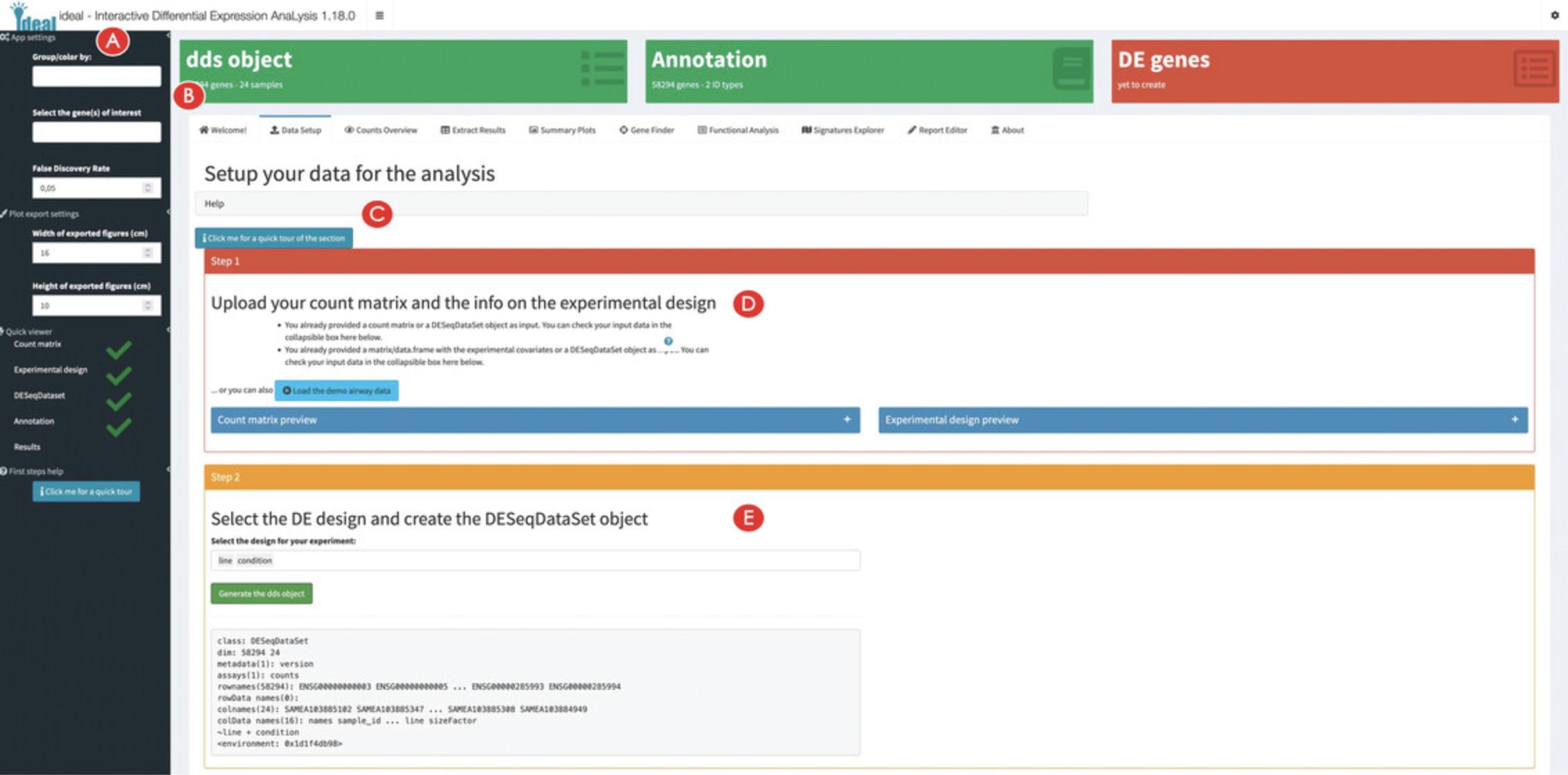
3.Setup the data for the analysis in ideal.
4.Specify the experimental design for the analysis.
5.Add a gene annotation and exclude samples from the analysis if required (optional).
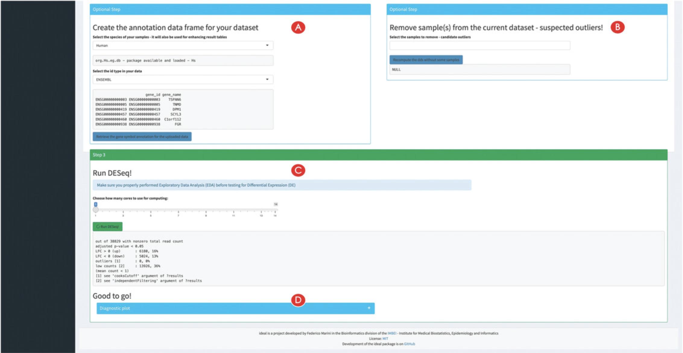
6.Run the differential expression analysis.
Exploring the count matrix and the differential expression result table
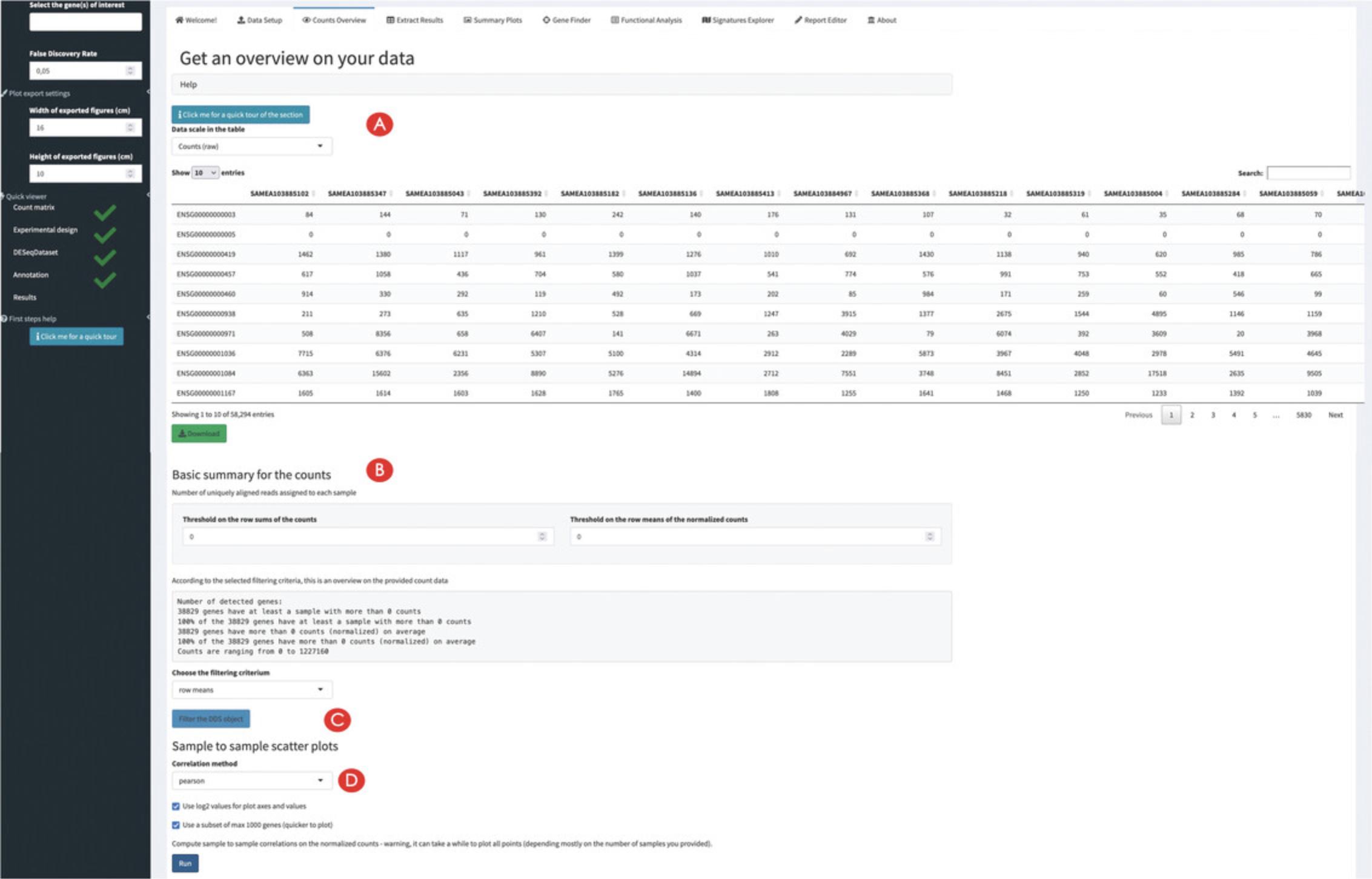
7.Inspect (and filter) the expression count matrix.
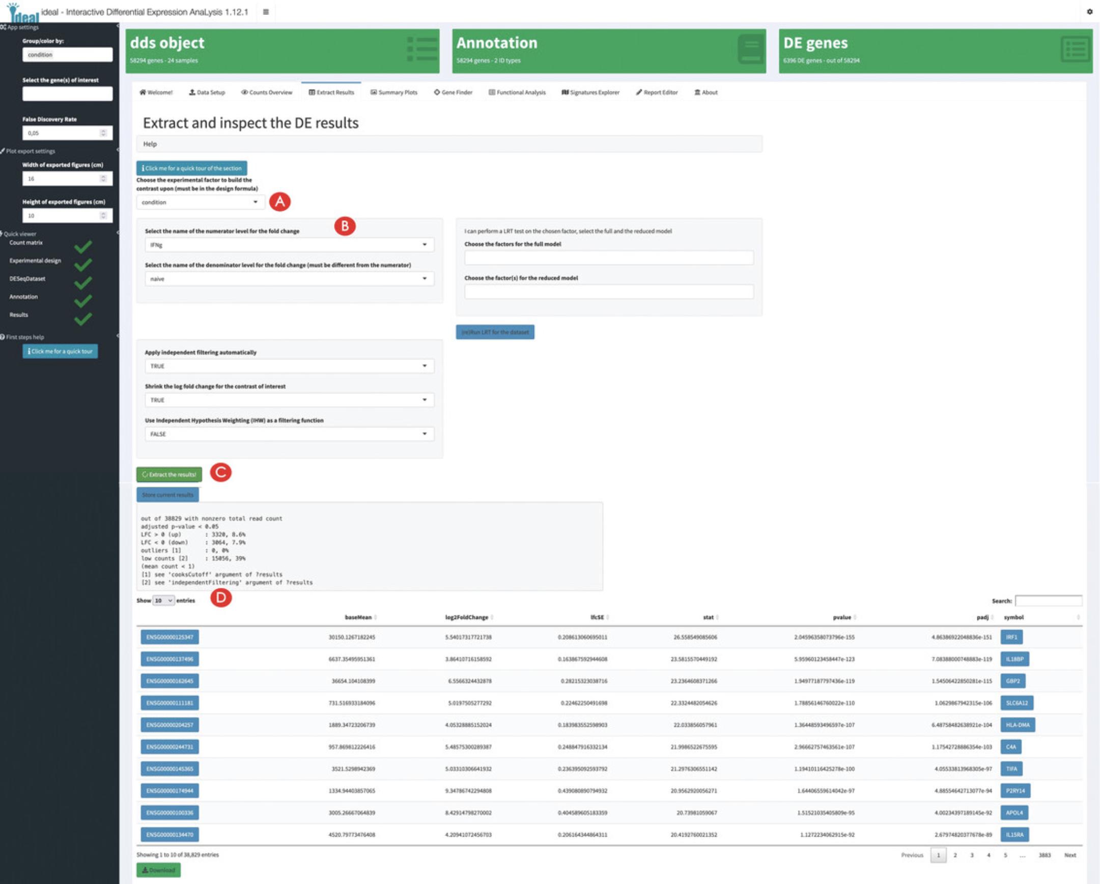
8.Compute the differential expression results.
9.Inspect the diagnostic plots for the extracted DE results.
Exploring overviews of the results and single genes of interest
10.Generate overview visual representations of the DE results.
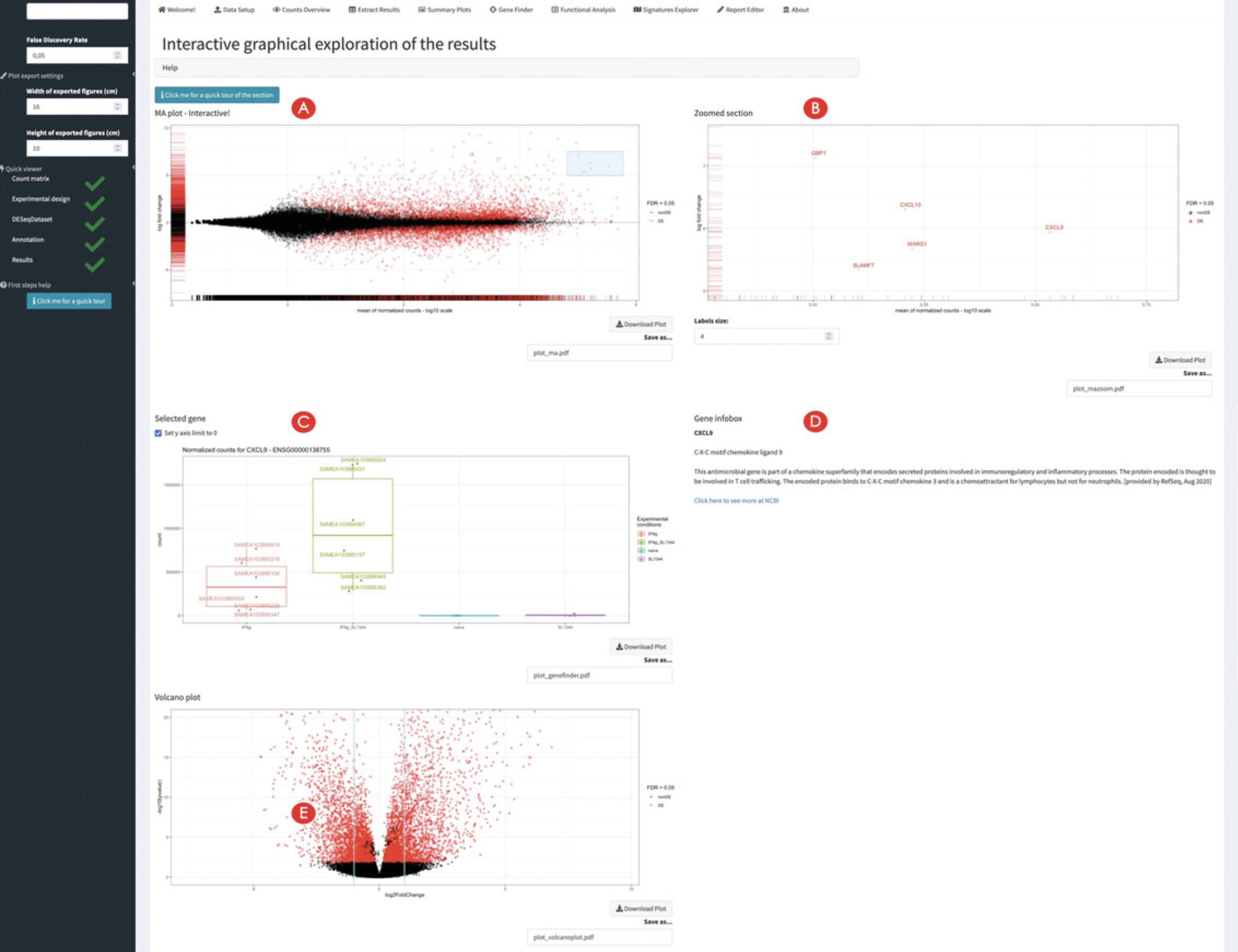
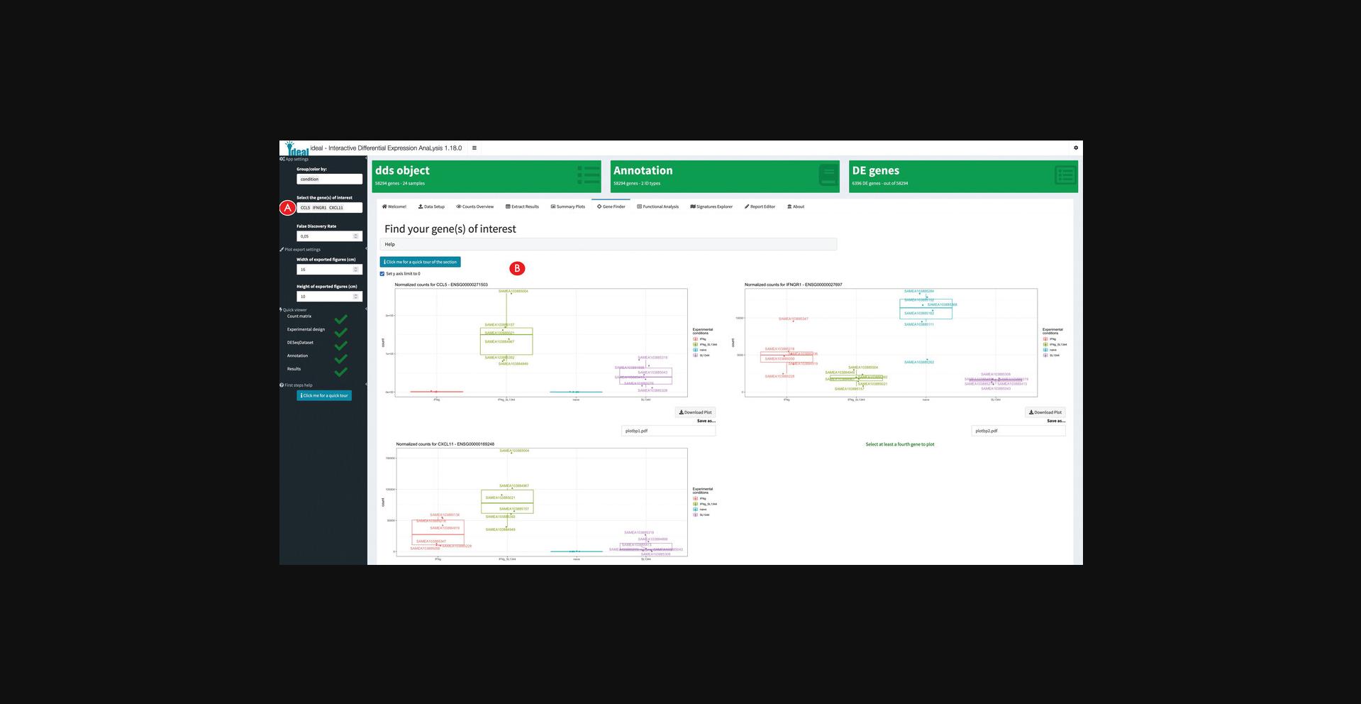
11.Inspect single genes upon interacting with the MA plot panel.
12.Inspect single genes upon manual selection.
Performing functional enrichment analyses on the data and exploring gene signatures
13.Calculate overrepresented biological processes in the set of differentially expressed genes.
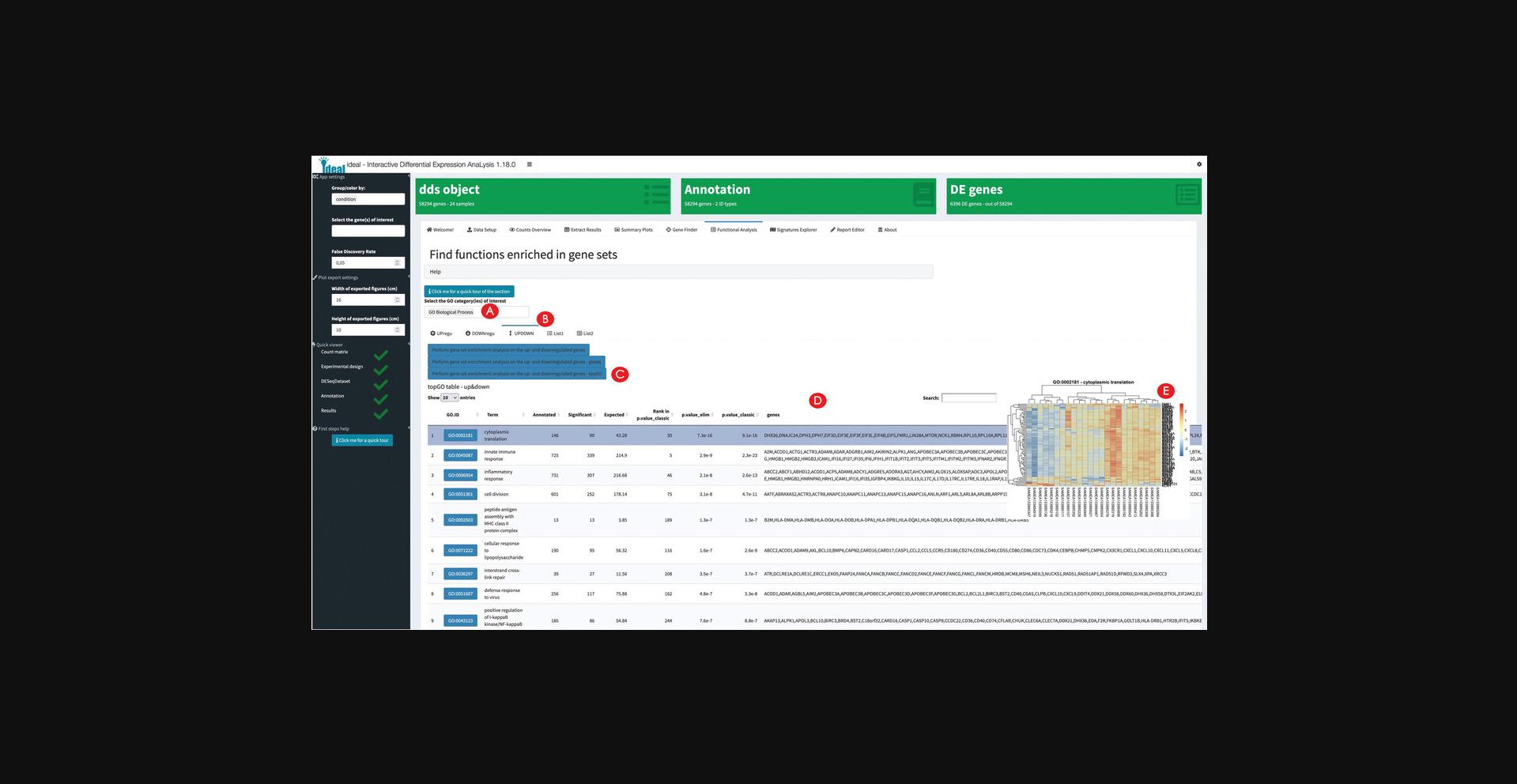
14.Explore the results of the enrichment analysis.
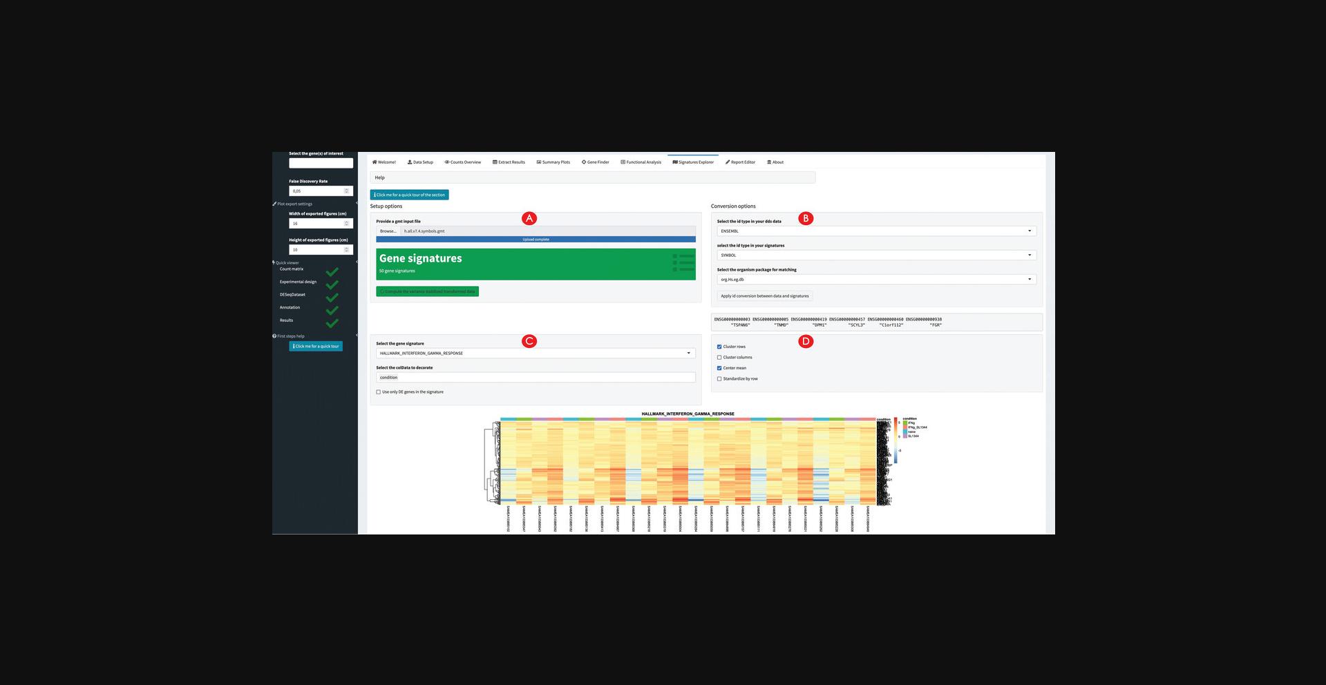
15.Explore the expression profiles of gene signatures.
Wrapping up the analysis with ideal
16.Generate, preview, and export an analysis report.
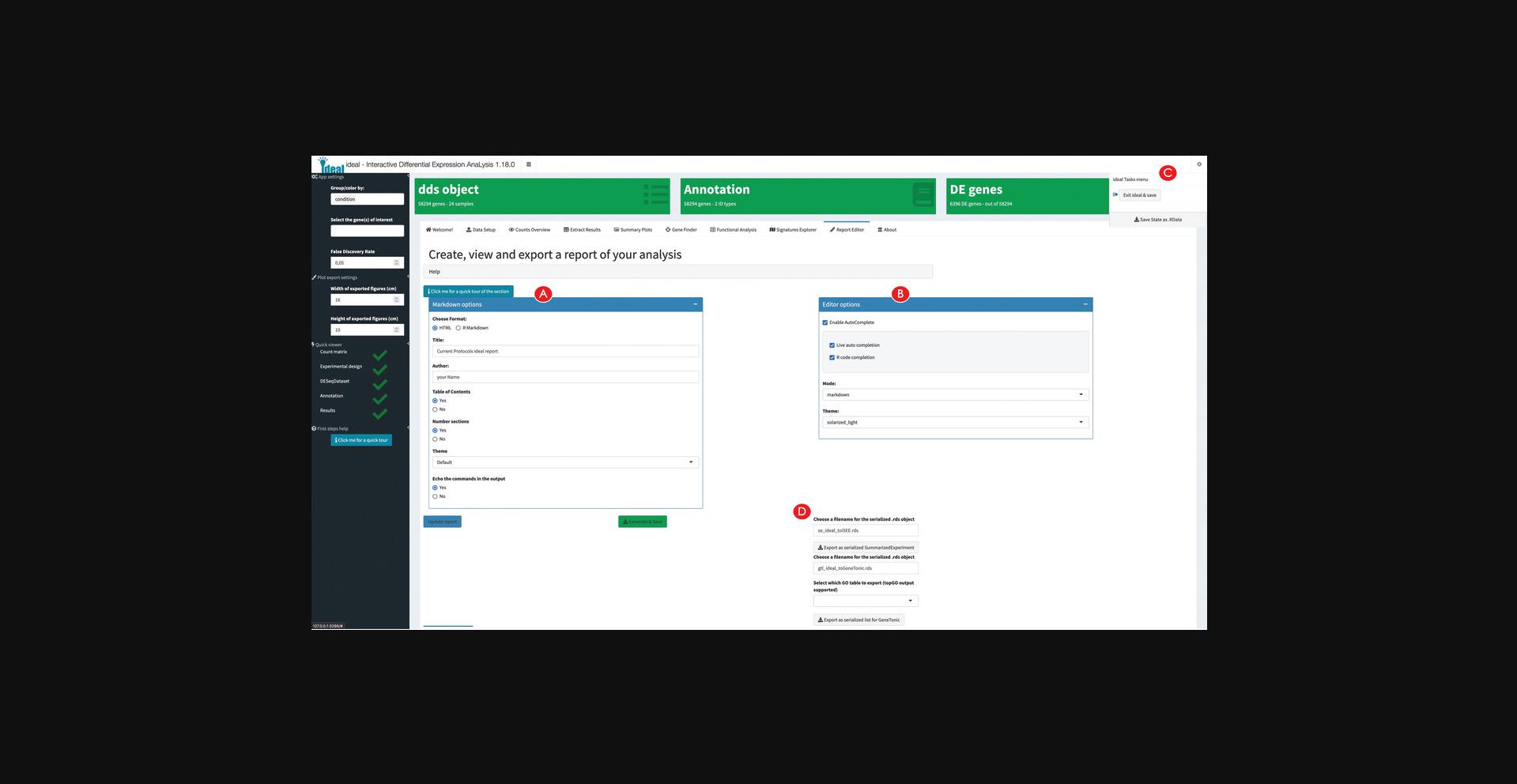
17.Export the analyses components for further downstream exploration.
Basic Protocol 3: INTERPRETATION OF RNA-seq RESULTS WITH GeneTonic
GeneTonic (Marini et al., 2021) is a Bioconductor package for streamlining the interpretation of results from differential expression analysis together with functional enrichment analysis, integrating these components with the original expression data and annotation tables for easy identifier conversion (Love et al., 2015). Blending together the existing pieces of transcriptome datasets in a Shiny web application (Chang et al., 2021), users can interactively generate insightful observations and hypotheses while still profiting from code reproducibility, guaranteed by the creation of an HTML report and code snippets meta-generated along the outputs.
In this protocol, we will describe its usage to analyze in depth the macrophage dataset (Alasoo et al., 2018) made available as a Bioconductor package itself (Huber et al., 2015). Samples from the macrophage dataset are available from six different donors, in four different conditions – naive, treated with interferon-gamma upon SL1344 (Salmonella enterica) infection, or with a combination of interferon-gamma and SL1344.We will focus our attention on the comparison between interferon-gamma treated samples versus naive samples – these results have been previously generated through the other Basic Protocols.
Necessary Resources
Hardware
- See detailed description in the Support Protocol
Software
- See detailed description in the Support Protocol
Files
- See detailed description in the Support Protocol. Specifically, this Basic Protocol will make use of the dataset delivered in the macrophage software package, from which it is possible to derive all necessary components, once the required dependencies are installed (as described in the Support Protocol).
- Alternatively, we provide a precomputed GeneTonicList object in the manuscript_CPBioinfo_2021 repository (see step 7 below) – the initial steps in this protocol specify the procedure to generate the components of this structured object (dds, res_de, res_enrich, and annotation_obj) (see Fig. 1A for a visual overview). Alternatively, it is also possible to generate the GeneTonicList object with ideal, as described in the final steps of Basic Protocol 2.
NOTE : Before using GeneTonic for exploring the full set of results from the differential expression analysis workflow, the necessary packages and dependencies need to be installed and loaded. The Support Protocol describes how to install and load the packages.
NOTE : The input data to be provided to GeneTonic can be computed via different workflows, but for simplicity it is easiest when using the framework of DESeq2 – we refer users to the package vignette for alternative methods upstream like limma or edgeR. If starting from this Basic Protocol, please use the following commands to generate the entire set of required files.
Generating the required input for running GeneTonic
1.Generate the DESeqDataSet object.
-
Loading the data
-
library("macrophage")
-
library("DESeq2")
-
library("GeneTonic")
-
data("gse", package = "macrophage")
-
dds_macrophage <- DESeqDataSet(gse, design = ∼line + condition)
-
Changing the ids, removing the GENCODE-specific suffix
-
rownames(dds_macrophage) <- substr(rownames(dds_macrophage), 1, 15)
-
Filtering low expressed features
-
keep <- rowSums(counts(dds_macrophage) >= 10) >= 6
-
dds_macrophage <- dds_macrophage[keep, ]
-
dds_macrophage
-
class: DESeqDataSet
-
dim: 17806 24
-
metadata(7): tximetaInfo quantInfo … txdbInfo version
-
assays(3): counts abundance avgTxLength
-
rownames(17806): ENSG00000000003 ENSG00000000419 … ENSG00000285982 ENSG00000285994
-
rowData names(2): gene_id SYMBOL
-
colnames(24): SAMEA103885102 SAMEA103885347 … SAMEA103885308 SAMEA103884949
-
colData names(15): names sample_id … condition line
2.Generate the differential expression result object.
-
running DESeq2 and extracting the results
- dds_macrophage <- DESeq(dds_macrophage)
- res_macrophage_IFNg_vs_naive <- results(dds_macrophage,
- contrast = c("condition", "IFNg", "naive"),
- lfcThreshold = 1,
- alpha = 0.05)
- res_macrophage_IFNg_vs_naive
SYMBOL -
Alternatively, the result is provided as precomputed object in the GeneTonic package
- data("res_de_macrophage", package = "GeneTonic")
3.Run the functional enrichment analysis.
-
Sort the results by FDR
-
library("AnnotationDbi")
-
Define the DE subset and the background set
-
de_symbols_IFNg_vs_naive <- deseqresult2df(res_macrophage_IFNg_vs_naive, FDR = 0.05)$SYMBOL
-
background_symbols <- rowData(dds_macrophage)$SYMBOL[rowSums(counts(dds_macrophage)) > 0]
-
Compute the enrichment results
-
library("topGO")
-
topgoDE_macrophage_IFNg_vs_naive <-
-
pcaExplorer::topGOtable(DEgenes = de_symbols_IFNg_vs_naive,
-
BGgenes = background_symbols,
-
ontology = "BP",
-
mapping = "org.Hs.eg.db",
-
geneID = "symbol",
-
topTablerows = 500)
-
Convert for usage in GeneTonic
-
res_enrich_macrophage <- shake_topGOtableResult(topgoDE_macrophage_IFNg_vs_naive)
-
Alternatively, the enrichment result is also available as a precomputed object
-
data("res_enrich_macrophage", package = "GeneTonic")
4.Construct the annotation object.
- library("org.Hs.eg.db")
- anno_df <- data.frame(
- gene_id = rownames(dds_macrophage),
- gene_name = mapIds(org.Hs.eg.db,
- keys = rownames(dds_macrophage),
- column = "SYMBOL",
- keytype = "ENSEMBL"),
- stringsAsFactors = FALSE,
- row.names = rownames(dds_macrophage)
- )
Alternatively, if following Basic Protocol 2 you obtained these objects via ideal, you can use this code chunk – you should replace the right-hand side of the assignment with the name of the objects in the environment in use.
- dds_object <- dds_from_ideal
- res_de_object <- res_from_ideal
- res_enrich_object <- shake_topGOtableResult(res_enrich_from_ideal)
- annotation_object <- annotation_from_ideal
5.Compute aggregated scores on the enrichment results (optional).
- res_enrich_macrophage <- get_aggrscores(
- res_enrich = res_enrich_macrophage,
- res_de = res_macrophage_IFNg_vs_naive,
- annotation_obj = anno_df,
- aggrfun = mean
- )
Preparing to run the GeneTonic application
6.Assemble the GeneTonicList object.
- gtl_macrophage <- GeneTonic_list(
- dds = dds_macrophage,
- res_de = res_macrophage_IFNg_vs_naive,
- res_enrich = res_enrich_macrophage,
- annotation_obj = anno_df
- )
7.Start the GeneTonic application.
- GeneTonic(gtl = gtl_macrophage)
Interestingly, this can be a common entry point for wet-lab scientists, who might benefit of the expertise of a bioinformatician to perform the steps upstream and receive a single serialized file to be loaded into the R environment. If encoded as a GeneTonicList (Fig. 1A, gray small box labeled BP3), this object would contain all the information regarding the experiment and setting of interest, as exemplified in the chunk below – you can also load a precomputed object, provided in the manuscript_CPBioinfo_2021 repository.
-
gtl_provided <- readRDS("path_to/gtl_object.RDS")
-
GeneTonic(gtl = gtl_provided)
-
using the version provided in the repository:
-
gtl_reimported <- readRDS("gtl_macrophage_exported.RDS")
-
describe_gtl(gtl_reimported)
-
GeneTonic(gtl = gtl_reimported)
First steps using GeneTonic
8.Explore the user interface of GeneTonic.
1.A header bar, where dropdown menus link to further documentation, and where the ‘Bookmark’ button is located, which is useful for recording features of interest during an interactive session (Fig. 22A) 2.A sidebar on the left, as the main way to access the different functionalities provided in the app (Fig. 22B) 3.A control bar on the right, where one can find most widgets to customize the appearance of the output (plots, tables, graphs, Fig. 22C). This can be opened and closed by clicking on the cogs icon in the top right corner. 4. The main body of the application, where different tabs are activated by clicking on the respective icons or text in the sidebar (Fig. 22D). In each of the panels, a context-specific interactive tour can be started by clicking on its respective button in the top right corner. This highlights in series the elements of the app, accompanying this with textual help that invites users to perform basic operations; this learning-by-doing approach is powered by the rintrojs library (Ganz, 2016).
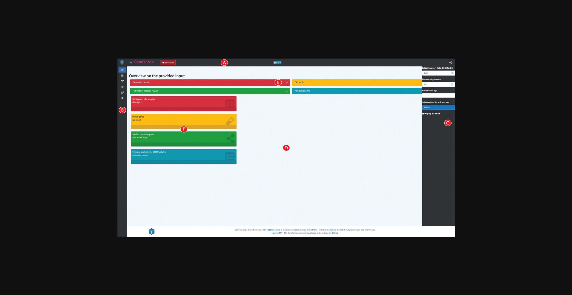
9.Explore an overview on the provided input.
Constructing an interactive gene-geneset network for functionally enriched biological processes
10.Create and explore the Gene-Geneset network.
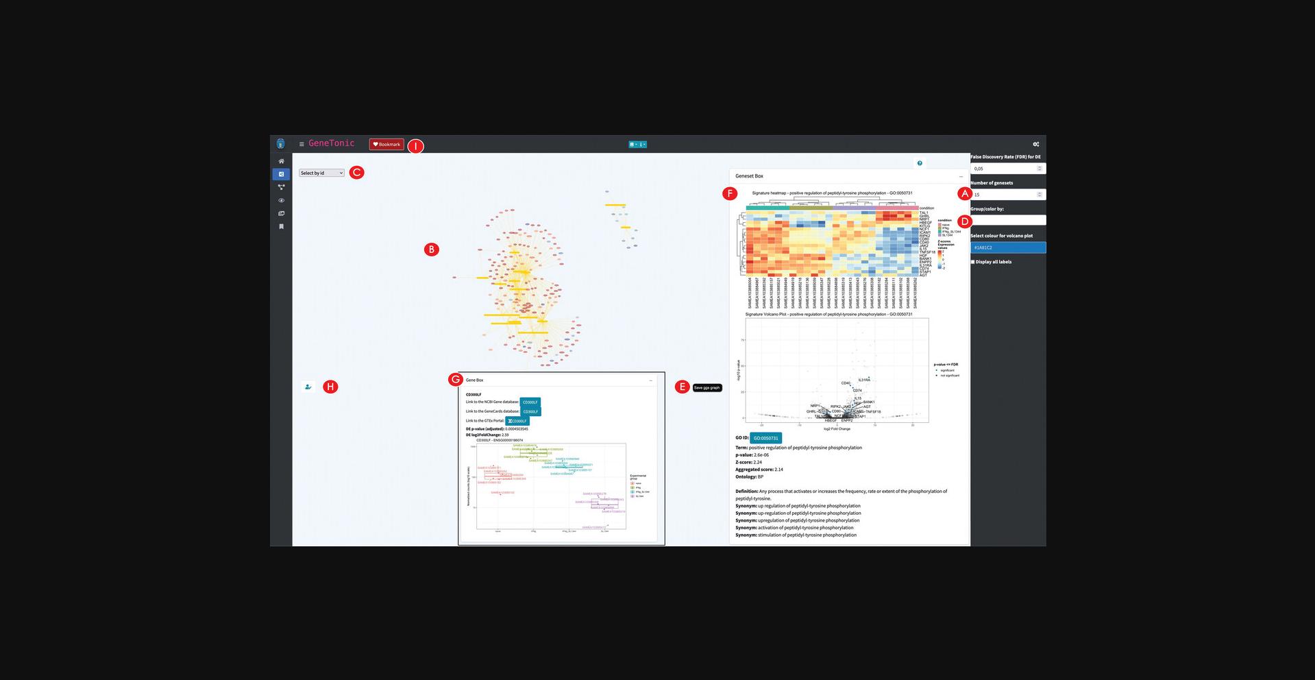
11.Edit the Gene-Geneset network.
12.Explore in depth the nodes of the network.
13.Bookmark a subset of genes and genesets.
14.Calculate and explore the backbone of the Gene-Geneset network.
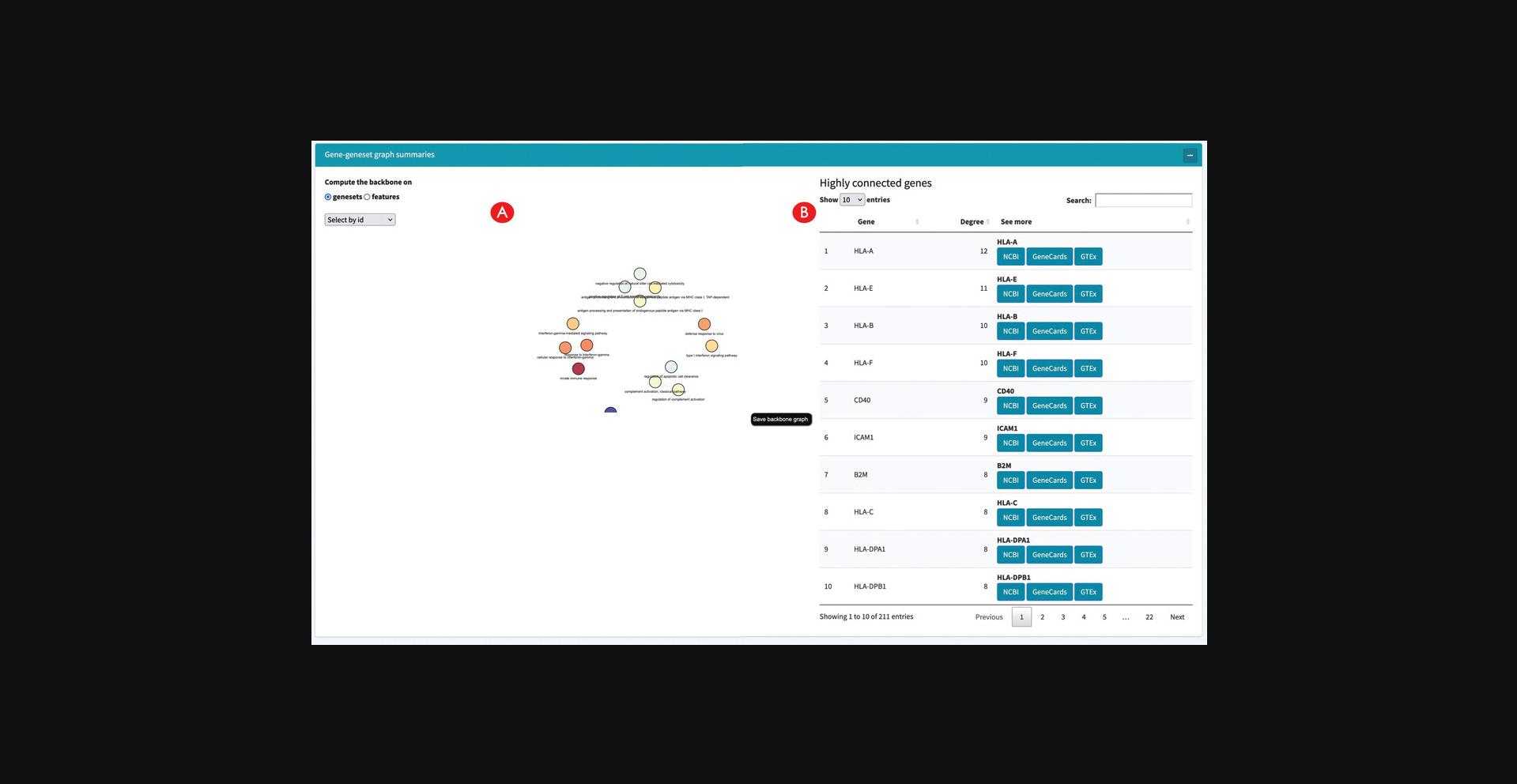
Building an interactive enrichment map for the functional enrichment results
15.Create an interactive enrichment map.
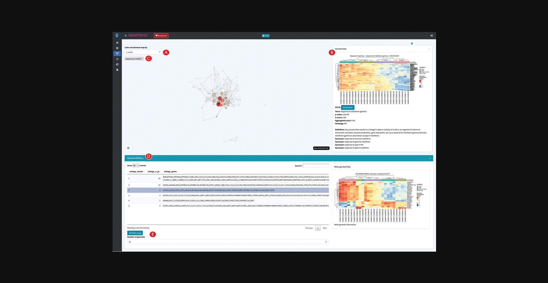
16.Explore the relationships between genesets.
17.Detect clusters of genesets to identify biological themes.
Exploring a set of summary visualizations for the enrichment results
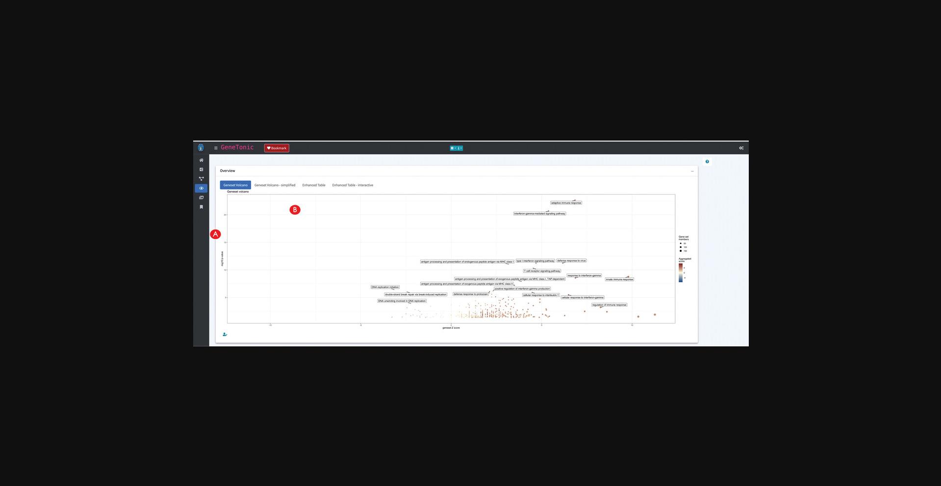
18.Generate multiple visual representations of the tabular enrichment results.
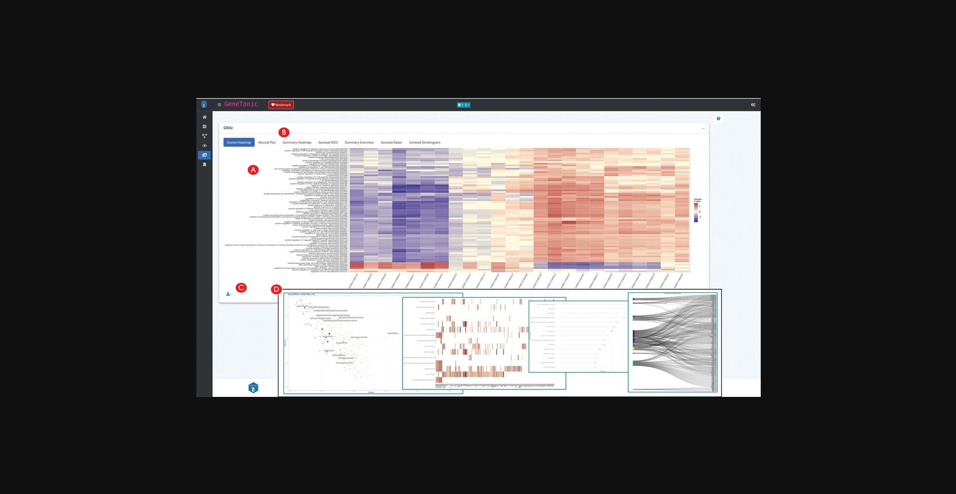
19.Create additional summary representations of the enrichment results.
Exploring the bookmarked features and generating a summary report
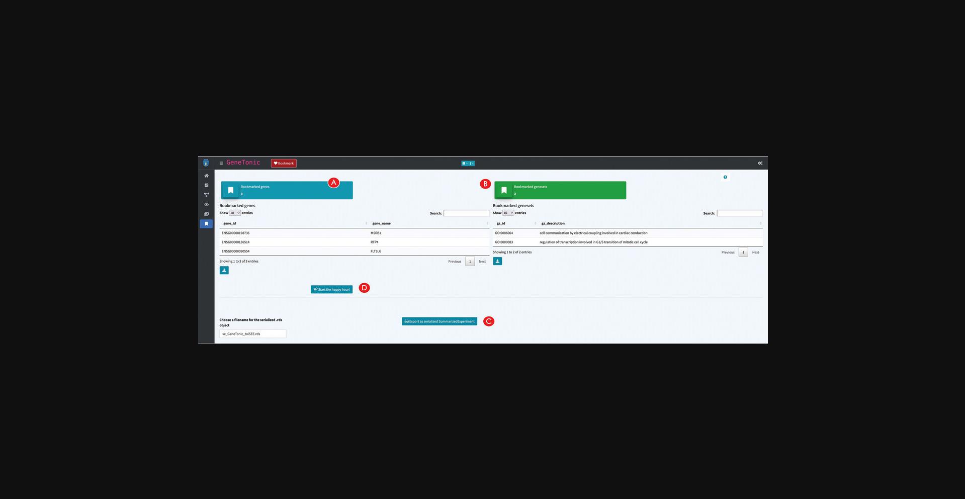
20.Retrieve the bookmarked features.
21.Export the data as SummarizedExperiment for further visualizations with iSEE.
22.Generate a full analysis report centered around the bookmarked features.
Support Protocol: DOWNLOADING AND INSTALLING pcaExplorer, ideal, and GeneTonic
The software presented in the Basic Protocols of this article is open source and freely available as R packages from the Bioconductor project (https://bioconductor.org). The package landing page of each software tool includes self-contained instructions that can be followed to install the latest stable version (Bioconductor release 3.14 at the time of writing). pcaExplorer, ideal, and GeneTonic share a common set of dependencies, automatically resolved and installed if the procedure illustrated in this Support Protocol is followed.
Necessary Resources
Hardware
- A desktop/laptop computer, with standard modern configuration, and an up-to-date operating system. The software packages presented in this article are distributed as R packages within the Bioconductor project, and support all platforms that can run R, including Windows (32-bit, 64-bit), MacOS (32-bit, 64-bit), or Unix/Linux systems.
- Recommended: 8-16 GB RAM
Software
- R version 4.1.0 or higher—latest stable releases are always available at https://cran.r-project.org/
- RStudio (optional) as Integrated Development Environment (IDE), downloadable from https://www.rstudio.com/products/rstudio/download/
A list of R packages:
-
BiocManager (https://cran.r-project.org/package=BiocManager, on CRAN)
-
pcaExplorer (https://bioconductor.org/packages/pcaExplorer, development version at https://github.com/federicomarini/pcaExplorer)
-
ideal (https://bioconductor.org/packages/ideal, development version at https://github.com/federicomarini/ideal)
-
GeneTonic (https://bioconductor.org/packages/GeneTonic, development version at https://github.com/federicomarini/GeneTonic)
-
A modern browser supporting JavaScript (Mozilla Firefox, Google Chrome, Opera, Safari, Microsoft Edge) to run the web applications, which otherwise can be launched from inside RStudio
Files
- Each of the Basic Protocols will operate on the data of the macrophage package available at https://bioconductor.org/packages/macrophage. This package contains data from a bulk RNA-seq analysis of Alasoo et al. (2018) – readers interested in exploring single-cell RNA-seq datasets are encouraged to use the iSEE and i2dash packages for this purpose (Rue-Albrecht et al., 2018; Ustjanzew, Preussner, Bentsen, Kuenne, & Looso, 2021), as also included in the Suggestions for Further Analysis section. For an easier reproducibility of the results presented in Basic Protocols 1 to 3, we prepared the data to be directly used in the protocols. All the prepared input for each protocol is available in the Input_data subfolder of the manuscript_CPBioinfo_2021 repository. This contains the following files: 1.A count matrix (countmatrix_macrophage.txt). The count matrix stores the number of times (i.e., counts) a certain feature (e.g., gene) is found in each sample, as a proxy of its expression. In the count matrix, the samples are stored in the columns, while the rows store the individual features. The individual entries can either be tab-, comma-, or semicolon-separated. The count matrix can be used as direct input to pcaExplorer and ideal, and can be used to obtain the DESeq object needed for GeneTonic (please refer to Basic Protocol 3 on how to obtain this from the count matrix). 2.A metadata file (metadata_macrophage.txt). The metadata file contains for each sample information about the relevant experimental variables. The individual samples represent the rows of the file, while the columns save the different experimental variables. The file can be tab-, comma-, or semicolon-separated, and can be used as direct input to pcaExplorer and ideal (refer to the inset of Fig. 2D for the expected formats). 3.An annotation file (annotation_macrophage.txt). The annotation file is optional for each of the presented applications; however, we highly recommend providing an annotation file to ease the interpretation of the results. The annotation file contains the feature identifiers of the count matrix in the gene_id column (or in the row names) and at least one column called gene_name which contains a more human readable form of the feature ids [e.g., HGNC gene names if the features are gene ids (Tweedie et al., 2020)]. The annotation file can directly be used as input in all three protocols. 4.A list of gene sets (h.all.v7.4.symbols.gmt). The gene set list contains a gene set name in the first column, a description in the second column, and several genes in the remaining columns (one gene per column). The described format is also called Gene Matrix Transposed (GMT) format, which is commonly used by online repositories such as the MSigDB database or the WikiPathways database. The GMT file format is a tab-delimited file format of gene sets, where each row represents a gene set. This file can be used as direct input to ideal.
- For an overview on how the information of these files is combined together to obtain all the relevant objects discussed in this manuscript, we refer to the workflow illustrated in Figure 1 (Strategic Planning).
1.Download and install R.
2.Download and install RStudio (optional).
3.Set up Bioconductor.
- install.packages("BiocManager")
- BiocManager::install()
4.Install the pcaExplorer, ideal, and GeneTonic packages.
- BiocManager::install(c("pcaExplorer", "ideal", "GeneTonic"), dependencies = TRUE)
- BiocManager::install()
Answer ‘yes’ when prompted in the console to download and install a potentially large set of packages.
5.Verify the installation.
- BiocManager::valid()
While R and Bioconductor maintain both a stable and a development version at all times, regular users should use the (stable) release version (unless a particular need arises for a functionality in the development branch).
To verify the correct installation of the pcaExplorer, ideal, and GeneTonic packages, run this command:
- library("pcaExplorer")
- library("ideal")
- library("GeneTonic")
If the R console returns no errors (i.e., if messages about dependencies being loaded, or information on the package versions are not problematic), the installation process is successfully completed.
6.Download the example data from the dedicated repository (optional).
-
via https
- git clone https://github.com/AnnekathrinSilvia/manuscript_CPBioinfo_2021.git
-
via ssh
- git clone git@github.com:AnnekathrinSilvia/manuscript_CPBioinfo_2021.git
7.Download and use a Docker image with all required packages (optional).
- docker pull federicomarini/pigt_currprotbioinfo:RELEASE_3_14
To run a container with all packages pre-installed and an instance of RStudio Server, run the command
- docker run -e PASSWORD=bioc -p 8787:8787
federicomarini/pigt_currprotbioinfo:RELEASE_3_14
Open your browser at the address localhost:8787, and enter ‘rstudio’ as a username and ‘bioc’ as a password (as specified in the command above), with port 8787 being mapped between the Docker container and your host machine. This will conveniently open RStudio Server in a sandbox-like environment, which also contains the reproducible workflows mentioned in step 6.
Alternate Protocol: USING FUNCTIONS FROM pcaExplorer, ideal, AND GeneTonic IN CUSTOM ANALYSES
Most of the functionality provided by the three packages described in the Basic Protocols can effectively be used throughout the steps that build up the entire RNA-seq analysis workflow (Love et al., 2015). This means that the exported functions can easily be called inside simple R scripts, or inserted into dedicated chunks of RMarkdown documents; their usage is documented in the package vignette and manual pages.
In this protocol, we will assemble a compact end-to-end analysis for the macrophage dataset, starting from the quantifications provided in the homonymous Bioconductor package (Alasoo et al., 2018). As in Basic Protocol 3, we will focus on the comparison between interferon-gamma treated samples versus naive samples, including all samples in the Exploratory Data Analysis preliminary to the modeling and statistical testing.
Necessary Resources
Hardware
See detailed description in the Support Protocol.
Software
See detailed description in the Support Protocol.
Files
- See detailed description in the Support Protocol. Specifically, this Alternate Protocol will make use of the data starting from the objects provided by the macrophage package, included in the dependencies for the software we are presenting in this work. Since this Alternate Protocol is extensively using the R terminal for executing the different steps, it is oriented toward an audience with some familiarity with command-line interfaces, but we provide enough details for welcoming a broad spectrum of readers.
NOTE : In the following steps, many functions from the presented packages will be showcased and briefly described. We refer users to the package documentation (accessible from the R terminal with simple calls such as ?get_annotation_orgdb) for additional details and further usage examples. A fully rendered version (including all the figures and other output) of this Alternate Protocol is also available as a pre-compiled document in the manuscript_CPBioinfo_2021 repository, associated to this manuscript and also used in the Support Protocol.
1.Load the expression data as DESeqDataSet object and create the associated annotation table.
-
Loading the packages
-
library("pcaExplorer")
-
library("ideal")
-
library("GeneTonic")
-
Loading the data
-
library("macrophage")
-
library("DESeq2")
-
data("gse", package = "macrophage")
-
dds_macrophage <- DESeqDataSet(gse, design = ∼line + condition)
-
Changing the ids, removing the GENCODE-specific suffix
-
rownames(dds_macrophage) <- substr(rownames(dds_macrophage), 1, 15)
-
dds_macrophage
-
Filtering low expressed features
-
keep <- rowSums(counts(dds_macrophage) >= 10) >= 6
-
dds_macrophage <- dds_macrophage[keep, ]
-
dds_macrophage
-
Construct the annotation data frame
-
library("org.Hs.eg.db")
-
anno_df <- get_annotation_orgdb(dds = dds_macrophage,
-
orgdb_species = "org.Hs.eg.db",
-
idtype = "ENSEMBL")
2.Generate a data transformation and perform PCA on the expression data.
-
vst_macrophage <- vst(dds_macrophage)
-
Alternatively, it is possible to use also the regularized log transformation
-
rld_macrophage <- rlog(dds_macrophage)
-
pcaplot(x = vst_macrophage,
-
intgroup = "condition",
-
ntop = 15000,
-
ellipse = FALSE)
-
pcaplot(x = vst_macrophage,
-
intgroup = "line_id",
-
ntop = 15000,
-
ellipse = FALSE)
3.Identify the genes with the highest loadings and plot their expression values.
- pca_results <- prcomp(t(assay(vst_macrophage)))
- hi_loadings(pca_results, topN = 20, whichpc = 1, annotation = anno_df)
- gene_plot(dds_macrophage,
- gene = "ENSG00000110944",
- intgroup = "condition",
- annotation_obj = anno_df)
- hi_loadings(pca_results, topN = 20, whichpc = 2, annotation = anno_df)
- gene_plot(dds_macrophage,
- gene = "ENSG00000084636",
- intgroup = "line_id",
- annotation_obj = anno_df)
4.Compute the enrichment on the top PCA loadings.
-
bg_ids <- rownames(dds_macrophage)
-
library("topGO")
-
pcs_enrichment <- pca2go(
-
se = vst_macrophage,
-
annotation = anno_df,
-
organism = "Hs",
-
ensToGeneSymbol = TRUE,
-
background_genes = bg_ids
-
)
-
save(pcs_enrichment, file="pcs_enrichment.RData")
-
display the results in interactive tables
-
DT::datatable(pcs_enrichment
posLoad) -
DT::datatable(pcs_enrichment
negLoad) -
DT::datatable(pcs_enrichment
posLoad) -
DT::datatable(pcs_enrichment
negLoad)
5.Run the DE modeling and extract the results.
-
running DESeq2 and extracting the results
-
dds_macrophage <- DESeq(dds_macrophage)
-
res_macrophage_IFNg_vs_naive_MLE <- results(
-
dds_macrophage,
-
name = "condition_IFNg_vs_naive",
-
lfcThreshold = 1,
-
alpha = 0.05)
-
res_macrophage_IFNg_vs_naive <- lfcShrink(
-
dds = dds_macrophage,
-
res = res_macrophage_IFNg_vs_naive_MLE,
-
coef = "condition_IFNg_vs_naive",
-
type = "apeglm")
-
res_macrophage_IFNg_vs_naive
SYMBOL
6.Generate summary overviews of the DE results.
-
summary(res_macrophage_IFNg_vs_naive)
-
de_table_ifng_vs_naive <- deseqresult2df(res_macrophage_IFNg_vs_naive)
-
etbl_de <- de_table_ifng_vs_naive
-
etbl_de
id, species = "Homo_sapiens") -
etbl_de
SYMBOL) -
DT::datatable(etbl_de, escape = FALSE, rownames = FALSE)
-
genes_of_interest <- c(
-
"ENSG00000125347", # IRF1
-
"ENSG00000110944", # IL23A
-
"ENSG00000084636", # COL16A1
-
"ENSG00000172399" # MYOZ2
-
)
-
plot_ma(res_obj = res_macrophage_IFNg_vs_naive,
-
intgenes = genes_of_interest)
-
plot_volcano(res_obj = res_macrophage_IFNg_vs_naive,
-
ylim_up = 40,
-
intgenes = genes_of_interest)
7.Run the functional enrichment analysis.
-
library("AnnotationDbi")
-
Define the DE subset and the background set
-
de_symbols_IFNg_vs_naive <- deseqresult2df(res_macrophage_IFNg_vs_naive, FDR = 0.05)$SYMBOL
-
background_symbols <- rowData(dds_macrophage)$SYMBOL[rowSums(counts(dds_macrophage)) > 0]
-
res_enrich_topGO <- pcaExplorer::topGOtable(
-
DEgenes = de_symbols_IFNg_vs_naive,
-
BGgenes = background_symbols,
-
ontology = "BP",
-
mapping = "org.Hs.eg.db",
-
geneID = "symbol",
-
topTablerows = 500
-
)
-
de_ids_IFNg_vs_naive <- deseqresult2df(res_macrophage_IFNg_vs_naive, FDR = 0.05)$id
-
background_ids <- rownames(dds_macrophage)[rowSums(counts(dds_macrophage)) > 0]
-
res_enrich_goseq <- ideal::goseqTable(
-
de.genes = de_ids_IFNg_vs_naive,
-
assayed.genes = background_ids,
-
genome = "hg38",
-
id = "ensGene",
-
testCats = "GO:BP",
-
addGeneToTerms = TRUE
-
)
-
Convert for usage in GeneTonic
-
res_enrich_macrophage <- shake_topGOtableResult(res_enrich_topGO)
-
etbl_enrich <- res_enrich_macrophage
-
etbl_enrich
gs_id) -
DT::datatable(etbl_enrich, escape = FALSE, rownames = FALSE)
-
res_enrich_macrophage <- get_aggrscores(
-
res_enrich = res_enrich_macrophage,
-
res_de = res_macrophage_IFNg_vs_naive,
-
annotation_obj = anno_df,
-
aggrfun = mean
-
)
-
gtl_macrophage <- GeneTonic_list(
-
dds = dds_macrophage,
-
res_de = res_macrophage_IFNg_vs_naive,
-
res_enrich = res_enrich_macrophage,
-
annotation_obj = anno_df
-
)
8.Generate a diverse set of representations for the enrichment results.
-
gs_heatmap(se = vst_macrophage,
-
gtl = gtl_macrophage,
-
geneset_id = "GO:0034341",
-
cluster_columns = TRUE,
-
cluster_rows = TRUE,
-
anno_info = "condition"
-
)
-
signature_volcano(gtl = gtl_macrophage,
-
geneset_id = "GO:0034341",
-
FDR = 0.05
-
)
The following chunk proposes alternatives to the classical tabular enrichment results, e.g., decomposing the contribution of the individual genes to a signature, or their overlap across signatures.
-
enhance_table(gtl = gtl_macrophage,
-
n_gs = 20,
-
chars_limit = 60)
-
gs_summary_overview(gtl = gtl_macrophage,
-
n_gs = 20,
-
p_value_column = "gs_pvalue",
-
color_by = "z_score")
-
gs_summary_heat(gtl = gtl_macrophage,
-
n_gs = 10)
-
gs_volcano(gtl = gtl_macrophage,
-
p_threshold = 0.05,
-
color_by = "aggr_score",
-
volcano_labels = 10,
-
gs_ids = NULL,
-
plot_title = "Gene set volcano")
The following chunk contains visual summaries highlighting the relationship between genesets, computed e.g., on the basis of their overlap.
-
gs_scoresheat(
-
mat = gs_scores(
-
se = vst_macrophage,
-
gtl = gtl_macrophage),
-
n_gs = 30
-
)
-
gs_dendro(gtl = gtl_macrophage,
-
n_gs = 30,
-
gs_dist_type = "kappa",
-
clust_method = "ward.D2",
-
color_leaves_by = "z_score",
-
size_leaves_by = "gs_pvalue",
-
color_branches_by = "clusters",
-
create_plot = TRUE)
-
gs_mds(gtl = gtl_macrophage,
-
n_gs = 200,
-
gs_ids = NULL,
-
similarity_measure = "kappa_matrix",
-
mds_k = 2,
-
mds_labels = 5,
-
mds_colorby = "z_score",
-
gs_labels = NULL,
-
plot_title = NULL)
Running the commands in the next chunk will create a gene-geneset graph and an enrichment map, as fully interactive HTML widgets that simplify the further exploration of complex network objects.
-
ggs_macrophage <- ggs_graph(
-
gtl = gtl_macrophage,
-
n_gs = 20)
-
ggs_macrophage
-
could be viewed interactively with
-
library("visNetwork")
-
library("magrittr")
-
ggs_macrophage %>%
-
visIgraph() %>%
-
visOptions(highlightNearest = list(enabled = TRUE,
-
degree = 1,
-
hover = TRUE),
-
nodesIdSelection = TRUE)
-
em_macrophage <- enrichment_map(gtl = gtl_macrophage,
-
n_gs = 30,
-
color_by = "z_score")
-
library("igraph")
-
library("visNetwork")
-
library("magrittr")
-
em_macrophage %>%
-
visIgraph() %>%
-
visOptions(highlightNearest = list(enabled = TRUE,
-
degree = 1,
-
hover = TRUE),
-
nodesIdSelection = TRUE)
9.Conclude the session by generating a report.
- happy_hour(gtl = gtl_macrophage,
- project_id = "HappyHour_BatchRun",
- mygenesets = gtl_macrophage
gs_id[c(1:5,11,31)], - mygenes = c("ENSG00000125347",
- "ENSG00000172399",
- "ENSG00000137496"),
- open_after_creating = TRUE
- )
10.Create a full RMarkdown report with all the previous steps (optional).
GUIDELINES FOR UNDERSTANDING RESULTS
Upon successful execution of the steps described in the protocols above, a set of output objects can be obtained, often specific to the different workflow components, i.e., exploratory data analysis, differential expression analysis, and functional interpretation. The main results produced by the web applications are represented by the tabular and visual (static and interactive) summaries that can be created during runtime. Additionally, each of the apps presented in the protocols has a reporting functionality, which can be exploited to conclude a session, and can deliver an HTML file that embeds not only this output, but also descriptive prose and the code to reproduce the analyses. The generation of such dynamic documents is essential to provide a simple means to share and store complete computational analyses.
Basic Protocol 1 covers the often under-appreciated step of exploratory data analysis. In this phase, it is essential to start from the raw expression matrix (also called the count matrix, due to the discrete nature of its entries) and proceed with normalized and transformed versions of it, according to the procedures to be applied afterwards. For example, variance-stabilizing and regularized logarithm transformations are well suited for the clustering of samples or other machine-learning applications. However, they do not work well for differential testing, which in turn operates on raw counts.
Once all the necessary data components have been generated, pcaExplorer presents a variety of useful summaries, starting from simple statistics on detected genes and general relationships among samples. The typical output of Principal Components Analysis can be explored with ease to better understand the reduced dimensional embedding of the data under inspection, both from the samples and from the genes point of view, as a preliminary yet fundamental operation of any downstream application – offering different manners in which to explore in-depth single features or subsets of features which are thereby accessible, empowering many users to perform more comprehensive and robust evaluations on the quality of the datasets and their implications. The PCA2GO functionality enables some direct biological interpretation of Principal Components, by which the enrichment of annotated functions and processes among the genes with top and bottom loadings for each axis is presented. This can often be valuable to explain some forms of unexpected variability, e.g., via contamination of samples, or due to failures in the experimental operations (e.g., degraded material from clinical specimen), or alternatively could be reflecting exposures and heritable expression patterns (as sources of “real” biological variation).
Thanks to the efficient combination of interactivity and reproducibility, pcaExplorer sets the stage for the following operations, which can be carried out as well in distinct iterations. For example, by clicking on the pcaExplorer task menu, users can save the state of all reactive elements to a binary RData object, or directly into an environment. This allows users to directly retrieve and reuse the DESeqDataSet object for the following protocols, or follow up with further scripted analyses, if alternative or additional workflows are expected to be applied. Promoting the use of standardized data structures streamlines the interoperability and implementation of the multitude of published methods and respective software.
Basic Protocol 2 guides the readers through a comprehensive workflow centered around differential expression analysis, one of the main applications when generating expression data with RNA-seq, aiming to identify the features which are associated with the phenotypic comparison of interest. Starting from a matrix of raw counts, the experimental covariates, and the specification of a design, the statistical testing is performed within the DESeq2 framework, with generalized linear models ensuring flexibility in the modeling strategy, combined with shrunken estimates of the effect sizes to account for the large dispersions observed at low expression levels. Some analysis approaches suggest removing lowly expressed genes (e.g., detected below a threshold in a defined number of samples) prior to perform the statistical testing itself. ideal also allows users to choose the IHW (Ignatiadis et al., 2016), a multiple testing adjustment procedure that can account for informative experimental covariates, thus allowing different prioritization of the individual hypotheses.
Most of the functionality in ideal is accessible once the necessary components have been generated: after creating a results table, a series of diagnostic and summary plots can be generated, including classical representations such as MA plots, volcano plots, or heatmaps for subsets of differentially expressed genes. Single genes can be inspected in detail, whereas additional information is automatically retrieved from the Entrez database; if more genes are selected, it is possible to seamlessly annotate the MA plot, to construct, e.g., the signature behavior of a gene set of interest (a shortlisted set from the literature, a candidate affected pathway, …).
Functional enrichment analysis on the split subsets of upregulated and downregulated genes can be performed with three different methods, and if desired can be applied to the entire set of differentially expressed genes. For example, in the macrophage dataset such functions can be readily visualized with heatmaps, which can give an immediate sense of the direction of regulation (an information which might be missing when considering simple sets of genes instead of pathways). Additional signatures can be explored by providing the corresponding GMT files, a format universally adopted to encode such information (Fabregat et al., 2018; Liberzon et al., 2015).
Throughout the entire application, the presence of tours is intended to guide prospective users across an exemplary hands-on use case, with components of the graphical interface highlighted as one proceeds to reinforce the learning experience. Again, an embedded reporting functionality builds the foundation to guarantee a reproducible analysis, and can be used as a bridge to subsequent downstream steps. The provided template includes in one single compiled document most of the usually employed summaries for such datasets. Alternatively, exporting the data under exploration as a generic container (a SummarizedExperiment) makes it amenable to further processing with many existing interoperable software in the Bioconductor ecosystem, including iSEE (Rue-Albrecht et al., 2018) for flexible bespoke graphical representations, or i2dash (Ustjanzew et al., 2021) for easy deployment of dedicated dashboards.
Basic Protocol 3 demonstrates how to use the GeneTonic package to combine and integrate all the different components that normally are available when analyzing an RNA-seq dataset end-to-end, with the objective to identify differentially expressed genes and to draw inferences about the regulated biological processes and pathways in the scenario(s) under investigation. Streamlining this time-consuming operation, where often the expertise of the wet lab scientist and clinician is an essential complement to the skills of a data analyst, can lead to a shorter turnaround time in generating sets of hypotheses, and in turn reduce the effort to transform data into actionable knowledge and insight.
Combining all the input objects into a validated instance of a GeneTonicList container class makes it straightforward for the set of functions provided to correctly access the information available in the respective slots. The creation of a variety of visual summaries, often more appealing than the commonly used tabular format, provides means to better interpret the expression dataset as a whole. Moreover, the interaction with HTML-based widgets and other elements of the user interface simplifies the many rounds of in-depth drilldown operations that focus on shortlisted genes and genesets, as a consequence of their biological relevance.
COMMENTARY
Background Information
Over the last two decades, advancements in sequencing technologies, accompanied by the reduction of costs to generate data, have significantly contributed to a widespread diffusion of RNA-seq as the standard method to perform quantitative and robust gene expression profiling. This could be observed in a variety of applications, covering basic research scenarios, but also clinical routine, e.g., providing valuable molecular readout to be exploited in tumor boards for personalized medicine.
This situation led to a massive increase in the data volume, and was supported by an extensive activity in developing methods, algorithms, and software tools that satisfy the needs of scientists for the many available workflows. While analysis methods are nowadays established for most of the mainstream applications of bulk RNA-seq (including expression quantification and differential expression analysis at the gene level), there is a pressing need for streamlining the process of extracting knowledge from these large, complex expression datasets. Experimental biologists and clinicians might encounter nontrivial difficulties in installing and adopting the tools of the trade, often available mainly for command-line usage. As a consequence, this constitutes a significant barrier in the workflow of a researcher, potentially affecting the timeline and budgeting of their projects—despite a considerable and commendable effort done by the developers in documenting their packages.
pcaExplorer, ideal, and GeneTonic are R/Bioconductor software packages that provide practical and easy-to-use, yet comprehensive and extendable user interfaces. These packages were designed aiming for an optimal combination of interactivity and reproducibility, implementing not only web applications in the R/Shiny framework, but also all the underlying R functions to be used also in standalone mode; as a principle, all these packages carefully document the undertaken choices with a seamless mechanism of reporting, based on the RMarkdown framework. A careful design and implementation of the user interfaces, supported by collapsible elements and tooltips and also coupled to the learning-by-doing approach provided via interactive tours, make sure that users can navigate efficiently through the large amount of widgets that control the execution of every workflow.
Other existing tools also aim to cover a number of the steps of the differential expression analysis procedure, and most were developed to operate on tabular-like summarized expression data, or on formats which might derive from their results, to be provided as text or spreadsheet files – often used to exchange information among collaboration partners. Many of these tools are not able to operate on the standardized formats output by the commonly used pipelines, making it difficult to provide comfortable entry points for experienced users that intend to exploit only a subset of their functionality. Our tools are fully integrated with the widely used containers proposed as standard in the scope of the Bioconductor ecosystem, and accommodate the output of a multitude of tools, especially for functional enrichment analyses, harmonizing their content so that all relevant results are directly usable and interoperable. Moreover, they provide a series of in-depth vignettes as additional documentation, which can be consulted any time as complete walkthroughs for the respective software packages. The modular design we envision for our applications makes it easy to incorporate them in existing workflows, encouraging the interoperability with other software packages.
Some of the alternative solutions are provided as web tools only, requiring the availability of an internet connection, or involve submitting local data to an external provider, an aspect that might be crucial when working with sensitive patient data. All our packages can be used locally, with simple installation instructions that automatically manage all software dependencies, ensuring a higher level of portability. Nonetheless, our packages offer the possibility for deployment as server-like applications, for internal usage (e.g., among members of an institution or a laboratory)—as showcased by the demo instances where occasional visitors can get familiar with the interfaces (see Internet Resources for detailed links and descriptions).
Even if our proposal cannot entirely guarantee the flexibility of the underlying tools when used from the command line, and is mostly tailored to scenarios dealing with bulk RNA-seq datasets (still widely used, especially in clinical and diagnostic settings), we cover the most commonly adopted experimental designs, and aim to simplify collaboration between users with different expertise. Such an approach can empower a large spectrum of users, making sure that their time is optimally invested, and liberating resources for more complex investigative and integrative tasks. As a side effect of exposing the users to the code (via RMarkdown reports, or via meta-generated code to reproduce figures and interactive widgets), our tools also have a didactic effect, encouraging the adoption of best practices for computational data analyses.
The discovery process for RNA-seq data is simplified and streamlined, with tools targeting both experienced analysts and scientists with an experimental background. Indeed, the reinforcement of the contact points between these groups can promote a transparent communication and exchange, and as a consequence significantly reduce the time to generate actionable insight, both in basic and clinical science settings. To pursue this objective further, we are continuously adding features to the software packages that we proposed in this set of protocols, including functionality to reduce the effort of adopting these tools, and to easily resume previous analysis sessions (e.g., by directly uploading at runtime GeneTonicList objects, and improving the bookmarking of interesting features/gene sets, available in the development branch of Bioconductor at the time of writing).
We envision the combined adoption of packages like pcaExplorer, ideal, and GeneTonic not only to help single users, but also to assist RNA-seq service providers/core facilities in progressing rapidly through the research projects they are involved in, thanks to the common ground offered by the graphical interfaces and the support for analyses that are reproducible and easily extendable in subsequent offline usage.
Critical Parameters
The default values for the parameters to be found in pcaExplorer, ideal, and GeneTonic have been defined to reflect the current best practices for appropriate exploration, modeling, and interpretation. In principle, this allows most users to start obtaining reasonable and robust output without the need of extensive tuning. Nevertheless, a variety of key parameters are customizable in all three applications to obtain a fine control on the final aspect of results and visualizations.
- Data transformations: Transformations of the raw counts are required to visually explore relationships between samples, and this normally includes a normalization step prior to the transformation itself. pcaExplorer offers the possibility to use variance stabilizing transformed (vst) values, regularized logarithm (rlog) transformed values, or, also, a simple logarithm operation after applying a small pseudocount offset. Among these methods, vst and rlog work well in a wide set of scenarios, and are therefore recommended. With small number of samples, the computing time is negligible.
- Number of most variable genes for running PCA: A subsetting operation is generally performed on the transformed values before computing the Principal Components, by selecting the number of top genes, ranked by their highest row-wise variance. This allows users to perform the calculations on the set of genes that carry signal, and at the same time reduces the computation time—this is especially noticeable when large numbers of samples are included. This value defaults to 300, but can be easily adjusted from the sidebar (also including potentially all genes if a large enough value is selected).
- Number of Principal Components to retain and explore: Every Principal Component explains an additional fraction of variability for the provided expression matrix. With increasing number of samples, and increasing complexity of the experimental covariate structure, it might be worth inspecting the relationships between samples in higher order PCs. The scree plot, also provided near the PCA plot in pcaExplorer, can be used as diagnostic guidance to select the number of PCs to focus on, using quantitative heuristic methods that define when the increment of explained variability is marginal (e.g., the elbow method). In most cases, the exploration of the first top 2-3 PCs can be sufficient to accurately capture the patterns in the data, especially if these are nicely matching the main reported experimental covariates.
- Definition of outlier samples: The PCA plot can be a valuable tool to determine whether a sample is to be considered an outlier (and potentially to be excluded from the subsequent steps). While it is tempting to “clean” the dataset in this manner, sometimes we do encounter inevitable experimental variability, and removing samples can have a detrimental effect on the detection power for differentially expressed genes. We advocate for additional checks, e.g., at the single-gene level if the hypothesis of a sample contamination might have occurred, driven by the prioritization made possible by ranking the genes according to their loadings on specific Principal Components.
- Expression level filtering of features: The definition of thresholds for detecting the expression of a gene can be easily done in the overview tabs of pcaExplorer and ideal. While useful to determine the number of expressed genes, this can be also beneficial for the modeling step, as the number of performed tests influences the multiple testing adjustment. By removing the low count genes from the pool of tested features, we can indeed find more genes to be significant among those that we keep, thus improving the power of our procedure. ideal implements the independent filtering approach (Bourgon et al., 2010), together with the option to use advanced procedures such as Independent Hypothesis Weighting (IHW, Ignatiadis et al., 2016), which is able to account for informative covariates and achieve higher power.
- Selection of an appropriate significance threshold: ideal makes use of the DESeq2 framework for modeling and testing, where the Benjamini-Hochberg (BH) adjustment (Benjamini & Hochberg, 1995) is adopted by default. The corresponding False Discovery Rate (FDR) value reflects the fraction of false positives one would expect to find, among all genes with an adjusted p -value less than or equal to the chosen value. This procedure is commonly adopted for the analysis of many high-throughput experimental assays, where the focus is on identifying and reporting a set of candidate genes, and we are aiming to have an upper bound value for the percent of false positives in this set. A commonly chosen value for this threshold is 0.05; a more liberal choice could be the value of 0.1, while a more stringent control can be induced by setting it to 0.01. This choice should ideally be performed in advance, when outlining the analysis plan. More refined testing approaches, e.g., against an effect size of values greater than 0 [which achieves a better control of the FDR, compared to the post-hoc filtering based on the log2 fold change of significant genes (Harrison, Pattison, Powell, & Beilharz, 2019; McCarthy & Smyth, 2009)], can also be performed outside the ideal application, and later provided as a DESeqResults object. This might be particularly relevant if the number of genes identified as DE is very large, and a prioritization might be needed to derive better (more specific) enrichment results.
- Specification of the design formula: An essential parameter that determines the identification of differentially expressed genes is represented by the design formula, to be defined in the ideal application. The design formula tells which experimental covariates from the metadata table specify the experimental design, and how these factors should in turn be used for the analysis. Simple design formulas with a single factor (e.g., ∼ condition) are able to handle the information regarding which of two (or more) groups each sample belongs to. For the macrophage dataset, we specify ∼ line + condition, meaning that we want to test for the effect of condition (e.g., IFN gamma vs. naive), while controlling for the effect of the different cell line of origin (stemming from the different donors). ideal supports any fixed-effects experimental design – if users desire to add interaction effects, this can be probably best specified during the generation of the dds object itself, before calling the main ideal() function. Additional insight on which contrasts can be addressed, depending on the selected design, can be retrieved with tools such as ExploreModelMatrix (Soneson et al., 2020). Consulting a biostatistician/bioinformatician is also recommended in case of more complex experimental designs, to make sure that this aspect is appropriately accounted for. An excellent resource with practical examples of code and graphical representations on how to select the appropriate design and contrasts is included in the work of Law et al. (2020).
- Performing enrichment analysis against proper background: As pointed out by a recent survey (Wijesooriya, Jadaan, Perera, & Kaur, 2021), the selection of an inappropriate background set to perform the enrichment analysis is a widespread issue. This might have serious consequences on the data interpretation steps, whereas the usage of a whole genome background results in artificially increased numbers of differentially regulated gene sets, potentially invalidating the entire analysis. The use of a background list consisting of all detected genes is essential to obtain solid enrichment results, and this approach is followed by the testing procedures implemented in ideal, which can later be fed to GeneTonic to streamline the contextualization of the results. Users should be wary of adopting tools that do not accept the specification of a background list, if performing enrichment analysis outside the workflows proposed in this series of protocols.
- Choosing gene set libraries to perform functional enrichment analyses: A large number and variety of collections for gene sets and pathways are currently available, and this can include Gene Ontology, MSigDB, and Reactome, just to name a few. Some tools are able to integrate different such databases, while others are specific to particular ontologies, and might be available only for specific species. pcaExplorer and ideal offer wrappers to the topGO (Alexa et al., 2006) and goseq methods (Young et al., 2010), which leverage the Bioconductor annotation packages and thus work in a wide range of scenarios. If possible, we recommend adopting open-source tools that use up-to-date libraries, and documenting which versions are used to ensure computational reproducibility. Our packages report the output of the session information command to simplify this task.
- Number of genesets displayed or included in computations: The choice of the subset of genesets and pathways included not only affects the computing time for some functions and derived objects, but also of course determines the appearance of the generated summaries. The default value in the GeneTonic application for this parameter is set to 15 (which is a reasonable amount when creating bipartite gene-geneset graphs), and this can be gradually increased to iteratively expand the scope of the exploration, in order to include the whole set of identified candidate pathways and obtain a comprehensive snapshot of the effects for the transcriptional regulation.
Troubleshooting
Table 1 provides troubleshooting information, covering some computational issues that may arise when running pcaExplorer, ideal, and GeneTonic. This complements the documentation bundled in each software package, provided as detailed vignettes, in which some frequently asked questions are answered in detail.
| Problem | Possible cause | Solution |
|---|---|---|
| Errors occur when loading the software packages | Version mismatch | Make sure to install a recent version of R and the matching version of Bioconductor; if needed, reinstall the packages as detailed in the Support Protocol. |
| Input files are not correctly read by the software packages | Unexpected file format provided, or incorrect input type |
Check the software documentation to determine if the provided files match the expected format (also described in the apps). Their content should also match the requirements—in most cases, raw counts are needed for statistical modeling (non-normalized). Sample names should also match the experimental covariates information. Make sure to use appropriate (unique, stable) identifiers, and let the conversion be handled by annotation tables. If planning to use the packages consecutively, we advise to provide the full set of required and recommended objects, and use the dedicated exporting functions to proceed to the subsequent steps. |
| Very low number of reads in the input count matrix | Errors in the mapping and/or quantification steps |
Check the logs generated by the mapping and quantification tools, to verify these steps have been performed correctly (selecting a matching annotation, specifying quantification parameters). If needed, check size of raw fastq files to exclude an error upstream of this. |
| The user interface does not match the expected content from the protocol steps/No content displayed | Missing components from the other steps | The user interface is responsive to the provided and currently computed internal components. Users might need to revisit some previous steps to make sure all elements are available – some upstream operations might still need to be completed. |
| Annotation step failures | Missing annotation packages | Install the annotation packages with the instructions provided in the app, and subsequently restart the session. |
| Error messages are displayed in the app/The app is crashing | Exception case handling, unexpected combination of inputs, incompatible versions |
Inspect the error messages from the applications and the console logs; these might already report a suggestion on how to overcome the error. Gentle fail mechanisms are already in place to cover most such cases; if the app keeps crashing, please consider filing an issue, accompanied by description of the usage that triggered this behavior as a reproducible example for the developers. |
| No results/labels are displayed | Non-matching identifiers | Check the correct specification of the annotation tables, and the selection of the species in use. |
| No genes detected as DE | Wrong specification of the design; unexpected experimental errors/variability |
Consider revisiting the specified design, and complement this with additional exploratory data analysis. While this can be rare, it can be that the transcriptional differences are very small—in this case, please consider inspecting single genes, especially if available as validation candidates. |
| No progress displayed after triggering operations | Long-running operations, large sample sizes in the provided input files |
Longer running operations (e.g., enrichment analyses with topGO) are normally accompanied by progress indicators and notifications that assist the users during the wait. Monitor such indicators and check the console for informative messages. |
| Failure in report generation | Incomplete installation/permissions | Running the reporting functionality on server versions of the app (as the demo instances) requires full installation and permissions for the literate programming framework. Please consider using a local version, or contact your system administrator. |
| Too generic enrichment results reported | Too large number of DE genes, or inappropriate method specified | Users can resort to different algorithms to compute enrichment results. For example, the topGO ‘elim’ method (suggested in ideal) is effective at pruning generic terms, prioritizing more specific and informative entries. |
| Species not supported for annotation and enrichment operations | No annotation packages available | While requiring some effort, it is still possible to provide manually constructed annotation tables, as long as they respect the requirements to correctly interoperate with the packages. Some enrichment-related functionality might not be available, if annotation packages are not provided. |
| Interactive widgets do not generate any output | Too large number of genesets selected, insufficient resources | Functions returning interactive widgets with graphs and networks can require additional resources for the rendering. Please select a small number of genesets to focus on initially, and avoid repeated interactions with the widgets—all operations are executed in sequence in a reactive environment. |
| Incompatible software versions used | Outdated installation of software | To correctly report the version in use for each software, use the About section in each application to retrieve the output of the session information as a basis to document your Material and Methods section. |
| Web applications not usable | Unfamiliarity with workflow step | Consult the package documentation, vignettes, read the in-app collapsible help elements, or execute the interactive tours to follow a learning-by-doing approach. |
| Unexpected failures when providing precomputed objects | Wrong object classes | If using the output of other similar workflows (edgeR, limma), please apply some conversion functions upstream (e.g., from the Bioconductor DEformats package). |
| Enrichment results are not compatible with the GeneTonic application/functions | Format not recognized/not matching |
Make sure the shaker functions are correctly applied to the output of the many available alternatives supported by GeneTonic. If the software used is not yet supported, consider filing an issue or contributing a conversion function. Moreover, it can be possible that these tools change the format of the returned output, and the shaker functions would need to be updated. |
| Plots are not displayed correctly | Incorrect set of options selected | For many of the visual output generated by the applications, options to control the final appearance are provided either in the sidebar, in the control bar, or directly close to the generated plot element. Make sure these options are correctly selected, especially if they are inadvertently reset during runtime. |
Additionally, we invite users having difficulties with our packages to ask questions and report issues on the Bioconductor Support Site (https://support.bioconductor.org/), as these are integrated into the large community-driven ecosystem of Bioconductor. If desired, we also invite readers to file a new issue on the respective GitHub repositories (see Internet Resources section), where the developer team can provide additional guidance.
Suggestions for Further Analysis
To easily recreate and extend the analyses performed in this article, we provide files to execute these protocols in a reproducible manner and several data files at the GitHub repository https://github.com/AnnekathrinSilvia/manuscript_CPBioinfo_2021.
Additional operations include the generation of bespoke customized plots, which is possible in the iSEE framework (Rue-Albrecht et al., 2018), or the comparison and integration of multiple DE results from related experimental scenarios (covariates with more than two factor levels, inclusion of additional variables in the statistical model, quantitative assessment of expression changes from different datasets), which is the focus of the DeeDee package (currently under development at https://github.com/lea-rothoerl/DeeDee).
The iterative nature of the analysis of such high-dimensional data can be assisted by other web applications, whose role might be complementary to the one proposed by pcaExplorer, ideal, and GeneTonic. As an example, the i2dash R package (Ustjanzew et al., 2021) is an excellent option to programmatically create and deploy such dashboards, as these can be coupled as data products to the existing R-based analysis pipelines. This usage makes i2dash suitable to be adopted in biostatistics/bioinformatics research facilities, reducing the effort to develop and deploy dedicated data products.
Overall, the adoption of classes that are well established in the Bioconductor ecosystem makes the usage of our software packages easy to integrate with additional workflow steps, efficiently defining alternative entry points without extensive need for interconversions and reducing the risk of information loss.
Acknowledgments
This work has been supported by the computing infrastructure provided by the Core Facility Bioinformatics at the University Medical Center Mainz, used also for deploying the demo instances of the packages.
We thank the users’ community of the pcaExplorer, ideal, and GeneTonic packages for valuable feedback, suggestions, and issue reporting, in particular the early adopters among the Bioconductor community.
The work of FM has been partially supported by the German Federal Ministry of Education and Research (BMBF 01EO1003).
Open access funding enabled and organized by Projekt DEAL.
Author Contributions
Annekathrin Ludt : conceptualization, data curation, formal analysis, investigation, methodology, software, validation, visualization, writing original draft, writing review and editing; Arsenij Ustjanzew : conceptualization, data curation, formal analysis, investigation, methodology, software, validation, visualization, writing original draft, writing review and editing; Harald Binder : conceptualization, funding acquisition, resources, software, supervision, writing review and editing; Konstantin Strauch : conceptualization, funding acquisition, project administration, resources, software, supervision, writing review and editing; Federico Marini : conceptualization, data curation, formal analysis, funding acquisition, investigation, methodology, project administration, resources, software, supervision, validation, visualization, writing original draft, writing review and editing.
Conflict of Interest
The authors declare no conflict of interest. The funders had no role in study design, data collection and analysis, decision to publish, or preparation of the manuscript.
Open Research
Data Availability Statement
The protocols described in this article use publicly available data (originally included in the work of Alasoo et al., 2018—PMID: 29379200, https://www.ebi.ac.uk/ena/browser/view/ERP020977), which can be accessed by users as a Bioconductor package, and additionally can be easily retrieved from our dedicated GitHub repository (https://github.com/AnnekathrinSilvia/manuscript_CPBioinfo_2021, listed in the Internet Resources section). An archive of this repository has been deposited at the moment of submission on Zenodo (https://doi.org/10.5281/zenodo.5810731).
Literature Cited
- Akhmedov, M., Martinelli, A., Geiger, R., & Kwee, I. (2020). Omics playground: A comprehensive self-service platform for visualization, analytics and exploration of big omics data. NAR Genomics and Bioinformatics , 2(1), 1–10. doi: 10.1093/nargab/lqz019.
- Alasoo, K., Rodrigues, J., Mukhopadhyay, S., Knights, A. J., Mann, A. L., Kundu, K., … Gaffney, D. J. (2018). Shared genetic effects on chromatin and gene expression indicate a role for enhancer priming in immune response. Nature Genetics , 50(3), 424–431. doi: 10.1038/s41588-018-0046-7.
- Alexa, A., Rahnenführer, J., & Lengauer, T. (2006). Improved scoring of functional groups from gene expression data by decorrelating GO graph structure. Bioinformatics , 22(13), 1600–1607. doi: 10.1093/bioinformatics/btl140.
- Amezquita, R. A., Lun, A. T. L., Becht, E., Carey, V. J., Carpp, L. N., Geistlinger, L., … Hicks, S. C. (2020). Orchestrating single-cell analysis with Bioconductor. Nature Methods , 17(2), 137–145. doi: 10.1038/s41592-019-0654-x.
- Anders, S., McCarthy, D. J., Chen, Y., Okoniewski, M., Smyth, G. K., Huber, W., & Robinson, M. D. (2013). Count-based differential expression analysis of RNA sequencing data using R and Bioconductor. Nature Protocols , 8(9), 1765–1786. doi: 10.1038/nprot.2013.099.
- Benjamini, Y., & Hochberg, Y. (1995). Controlling the false discovery rate: A practical and powerful approach to multiple testing. Journal of the Royal Statistical Society , 57(1), 289–300. doi: 10.2307/2346101.
- Bourgon, R., Gentleman, R., & Huber, W. (2010). Independent filtering increases detection power for high-throughput experiments. Proceedings of the National Academy of Sciences , 107(21), 9546–9551. doi: 10.1073/pnas.0914005107.
- Chang, W., Cheng, J., Allaire, J. J., Sievert, C., Schloerke, B., Xie, Y., … Borges, B. (2021). shiny: Web application framework for R. https://cran.r-project.org/package=shiny.
- Conesa, A., Madrigal, P., Tarazona, S., Gomez-Cabrero, D., Cervera, A., McPherson, A., … Mortazavi, A. (2016). A survey of best practices for RNA-seq data analysis. Genome Biology , 17(1), 13. doi: 10.1186/s13059-016-0881-8.
- Domagalski, R., Neal, Z. P., & Sagan, B. (2021). Backbone: An R package for extracting the backbone of bipartite projections. PLoS One , 16(1), e0244363. doi: 10.1371/journal.pone.0244363.
- Fabregat, A., Jupe, S., Matthews, L., Sidiropoulos, K., Gillespie, M., Garapati, P., … D'Eustachio, P. (2018). The reactome pathway knowledgebase. Nucleic Acids Research , 46(D1), D649–D655. doi: 10.1093/nar/gkx1132.
- Ganz, C. (2016). Rintrojs: A wrapper for the intro.js library. The Journal of Open Source Software , 1(6), 2016. doi: 10.21105/joss.00063.
- Geistlinger, L., Csaba, G., Santarelli, M., Ramos, M., Schiffer, L., Turaga, N., … Waldron, L. (2020). Toward a gold standard for benchmarking gene set enrichment analysis. Briefings in Bioinformatics , 00, August 2019, 1–12. doi: 10.1093/bib/bbz158.
- Harrison, P. F., Pattison, A. D., Powell, D. R., & Beilharz, T. H. (2019). Topconfects: A package for confident effect sizes in differential expression analysis provides a more biologically useful ranked gene list. Genome Biology , 20(1), 67. doi: 10.1186/s13059-019-1674-7.
- Howe, K. L., Achuthan, P., Allen, J., Allen, J., Alvarez-Jarreta, J., Amode, M. R., … Flicek, P. (2021). Ensembl 2021. Nucleic Acids Research , 49(D1), D884–D891. doi: 10.1093/nar/gkaa942.
- Huber, W., Carey, V. J., Gentleman, R., Anders, S., Carlson, M., Carvalho, B. S., … Morgan, M. (2015). Orchestrating high-throughput genomic analysis with Bioconductor. Nature Methods , 12(2), 115–121. doi: 10.1038/nmeth.3252.
- Ignatiadis, N., Klaus, B., Zaugg, J. B., & Huber, W. (2016). Data-driven hypothesis weighting increases detection power in genome-scale multiple testing. Nature Methods , 13(7), 577–580. doi: 10.1038/nmeth.3885.
- Jolliffe, I. T. (2002). Principal component analysis, second edition. Encyclopedia of Statistics in Behavioral Science , 30(3), 487. doi: 10.2307/1270093.
- Law, C. W., Zeglinski, K., Dong, X., Alhamdoosh, M., Smyth, G. K., & Ritchie, M. E. (2020). A guide to creating design matrices for gene expression experiments. F1000Research , 9, 1444. doi: 10.12688/f1000research.27893.1.
- Li, X., & Wang, C.-Y. (2021). From bulk, single-cell to spatial RNA sequencing. International Journal of Oral Science , 13(1), 1–6. doi: 10.1038/s41368-021-00146-0.
- Liberzon, A., Birger, C., Thorvaldsdóttir, H., Ghandi, M., Mesirov, J. P., & Tamayo, P. (2015). The molecular signatures database hallmark gene set collection. Cell Systems , 1(6), 417–425. doi: 10.1016/j.cels.2015.12.004.
- Love, M. I., Anders, S., Kim, V., & Huber, W. (2015). RNA-Seq workflow: Gene-level exploratory analysis and differential expression. F1000Research , 4, 1070. doi: 10.12688/f1000research.7035.1.
- Love, M. I., Huber, W., & Anders, S. (2014). Moderated estimation of fold change and dispersion for RNA-seq data with DESeq2. Genome Biology , 15(12), 550. doi: 10.1186/s13059-014-0550-8.
- Marini, F., & Binder, H. (2016). Development of applications for interactive and reproducible research: A case study. Genomics and Computational Biology , 3(1), 39. doi: 10.18547/gcb.2017.vol3.iss1.e39.
- Marini, F., & Binder, H. (2019). pcaExplorer: An R/Bioconductor package for interacting with RNA-seq principal components. BMC Bioinformatics , 20(1), 331. doi: 10.1186/s12859-019-2879-1.
- Marini, F., Linke, J., & Binder, H. (2020). ideal: An R/Bioconductor package for interactive differential expression analysis. BMC Bioinformatics , 21(1), 565. doi: 10.1186/s12859-020-03819-5.
- Marini, F., Ludt, A., Linke, J., & Strauch, K. (2021). GeneTonic: An R/Bioconductor package for streamlining the interpretation of RNA-seq data. BMC Bioinformatics , 22(1), 610. doi: 10.1186/s12859-021-04461-5.
- McCarthy, D. J., & Smyth, G. K. (2009). Testing significance relative to a fold-change threshold is a TREAT. Bioinformatics , 25(6), 765–771. doi: 10.1093/bioinformatics/btp053.
- McCarthy, Davis J., Chen, Y., & Smyth, G. K. (2012). Differential expression analysis of multifactor RNA-Seq experiments with respect to biological variation. Nucleic Acids Research , 40(10), 4288–4297. doi: 10.1093/nar/gks042.
- McDermaid, A., Monier, B., Zhao, J., Liu, B., & Ma, Q. (2018). Interpretation of differential gene expression results of RNA-seq data: Review and integration. Briefings in Bioinformatics , 00, April, 1–11. doi: 10.1093/bib/bby067.
- Mortazavi, A., Williams, B. A., McCue, K., Schaeffer, L., & Wold, B. (2008). Mapping and quantifying mammalian transcriptomes by RNA-Seq. Nature Methods , 5(7), 621–628. doi: 10.1038/nmeth.1226.
- Ritchie, M. E., Phipson, B., Wu, D., Hu, Y., Law, C. W., Shi, W., & Smyth, G. K. (2015). Limma powers differential expression analyses for RNA-sequencing and microarray studies. Nucleic Acids Research , 43(7), e47. doi: 10.1093/nar/gkv007.
- Rue-Albrecht, K., Marini, F., Soneson, C., & Lun, A. T. L. (2018). iSEE: Interactive summarized experiment explorer. F1000Research , 7(0). 741. doi: 10.12688/f1000research.14966.1.
- Rutter, L., Moran Lauter, A. N., Graham, M. A., & Cook, D. (2019). Visualization methods for differential expression analysis. BMC Bioinformatics , 20(1), 1–31. doi: 10.1186/s12859-019-2968-1.
- Salit, M., & Woodcock, J. (2021). MAQC and the era of genomic medicine. Nature Biotechnology , 39(9), 1066–1067. doi: 10.1038/s41587-021-01050-y.
- Schweder, T., & Spjøtvoll, E. (1982). Plots of P-values to evaluate many tests simultaneously. Biometrika , 69(3), 493–502. doi: 10.1093/biomet/69.3.493.
- Soneson, C., Love, M. I., & Robinson, M. D. (2015). Differential analyses for RNA-seq: Transcript-level estimates improve gene-level inferences. F1000Research , 4(0), 1521. doi: 10.12688/f1000research.7563.2.
- Soneson, C., Marini, F., Geier, F., Love, M. I., & Stadler, M. B. (2020). Explore model matrix: Interactive exploration for improved understanding of design matrices and linear models in R. F1000Research , 9512. doi: 10.12688/f1000research.24187.1.
- Tweedie, S., Braschi, B., Gray, K., Jones, T. E. M., Seal, R. L., Yates, B., & Bruford, E. A. (2020). Genenames.org: The HGNC and VGNC resources in 2021. Nucleic Acids Research , 49, November 2020, 939–946. doi: 10.1093/nar/gkaa980.
- Ustjanzew, A., Preussner, J., Bentsen, M., Kuenne, C., & Looso, M. (2021). i2dash: Creation of flexible, interactive and web-based dashboards for visualization of omics data. Genomics, Proteomics & Bioinformatics, Jul 16 , S1672-0229(21)00149-2. doi: 10.1016/j.gpb.2021.01.007.
- Van den Berge, K., Hembach, K. M., Soneson, C., Tiberi, S., Clement, L., Love, M. I., … Robinson, M. D. (2019). RNA sequencing data: Hitchhiker's guide to expression analysis. Annual Review of Biomedical Data Science , 2(1), 139–173. doi: 10.1146/annurev-biodatasci-072018-021255.
- Wang, Z., Gerstein, M., & Snyder, M. (2009). RNA-Seq: A revolutionary tool for transcriptomics. Nature Reviews Genetics , 10(1), 57–63. doi: 10.1038/nrg2484.
- Wijesooriya, K., Jadaan, S. A., Perera, K. L., & Kaur, T. (2021). Guidelines for reliable and reproducible functional enrichment analysis. BioRxiv , 1–21.
- Young, M. D., Wakefield, M. J., Smyth, G. K., & Oshlack, A. (2010). Gene ontology analysis for RNA-seq: Accounting for selection bias. Genome Biology , 11(2), R14. doi: 10.1186/gb-2010-11-2-r14.
- Zhang, W., Yu, Y., Hertwig, F., Thierry-Mieg, J., Zhang, W., Thierry-Mieg, D., … Fischer, M. (2015). Comparison of RNA-seq and microarray-based models for clinical endpoint prediction. Genome Biology , 16(1), 1–12. doi: 10.1186/s13059-015-0694-1.
Key References
- Marini et al., 2016. See above.
This is the first description of the conceptual framework to combine interactivity and reproducibility, particularly in the context of genomics data analysis with R and Bioconductor, supported by the reactivity provided by Shiny for developing web applications.
- Marini et al., 2019. See above.
The first description of the pcaExplorer package, as an interactive and comprehensive interface for performing exploratory data analysis on RNA-seq data, focusing on the unsupervised statistical learning framework of principal components analysis (PCA). This package also provides functional interpretation of principal components, and is designed to assist a broad range of researchers by combining the ease of use of a graphical user interface with the automated reporting embedded in the main application.
- Marini et al., 2020. See above.
The original publication of the ideal software package, designed to simplify the most common steps related to the statistical modeling and testing in differential expression analysis workflows of bulk RNA-seq data. Tabular and visual outputs are provided, providing users with a web application to guide them through the different aspects—from simple overviews to functional analysis of identified candidate transcriptional regulators. Here, the full report bundled with the package provides again the means to share and store a reproducible track of the performed analysis, which can also be extended by advanced users.
- Marini et al., 2021. See above.
This work describes the GeneTonic package, designed to assist users in the interpretation of results from transcriptome profiling experiments via RNA-seq. This complex task often involves the integration of different tabular outputs, and GeneTonic streamlines these time-consuming operations that often require the expertise of life or medical scientists. Interoperability with the main analysis workflows and tools for enrichment analysis make this package a candidate for wide adoption among scientists, also providing automated reporting on bookmarked features to better understand transcriptional regulation at the gene and the pathway level.
- Rue-Albrecht et al., 2018. See above.
This work presents iSEE, a general purpose visualization tool for analyzing any type of two-dimensional high throughput assay, notably including single cell RNA-seq, that can be stored as a SummarizedExperiment object. Focusing on the customizability of the generated outputs, which can simultaneously represent all aspects of the provided input data, and with dynamic linking between panels, iSEE is complemented by meta-generated code tracking for ensuring computational reproducibility.
- Ustjanzew et al., 2021. See above.
i2dash is an R package designed to assist in the programmatic creation of customized dashboards from the scratch, dynamically generating a web application that can ideally be coupled to any R-based analysis pipeline. This usage makes i2dash suitable to be adopted in biostatistics/bioinformatics research facilities, reducing the effort to develop and deploy dedicated data products.
Internet Resources
- https://bioconductor.org/packages/pcaExplorer
- https://bioconductor.org/packages/ideal
- https://bioconductor.org/packages/GeneTonic
Official Bioconductor homepages for the presented packages. The best place to retrieve the latest released versions of the packages and their documentation.
Bioconductor support site. Ideally, the best place to ask questions and obtain help from a large community of Bioconductor users and developers.
- https://github.com/federicomarini/pcaExplorer
- https://github.com/federicomarini/ideal
- https://github.com/federicomarini/GeneTonic
Development branches on GitHub. This is the location to find the latest development versions of each package, which might include some experimental features. The rendered project pages serve as an additional location to directly consult the documentation for the development versions.
Source code and data to reproduce the presented protocols. Thought of as a complement to the classical manuscript, it includes executable documents that simplify the learning process. This repository also contains the instructions to generate a Docker image where all tools and dependencies are automatically provided, running the RStudio Server IDE to provide a full environment to try the functionality of the packages.
- http://shiny.imbei.uni-mainz.de:3838/pcaExplorer
- http://shiny.imbei.uni-mainz.de:3838/ideal
- http://shiny.imbei.uni-mainz.de:3838/GeneTonic
Demo instances of the presented web applications. For each of these, a demonstration dataset has been included and can be used to showcase the functionality of the packages.
Workshop video on the GeneTonic package, presented at the BioC2021 conference.
Citing Literature
Number of times cited according to CrossRef: 1
- Robin A. Pilz, Dariush Skowronek, Lara Mellinger, Sander Bekeschus, Ute Felbor, Matthias Rath, Endothelial Differentiation of CCM1 Knockout iPSCs Triggers the Establishment of a Specific Gene Expression Signature, International Journal of Molecular Sciences, 10.3390/ijms24043993, 24 , 4, (3993), (2023).

