GSEA
Karina Jhingan
Abstract
This is a GSEA and GSVA analysis on time series data that creates barplots showing how the enrichment score varies over the series of time
Steps
Introduction
This pipeline is based off of http://yulab-smu.top/biomedical-knowledge-mining-book/universal-api.html
Load Libraries
uncomment installs if needed
#BiocManager::install(organism, character.only = TRUE)
#install.packages("ggridges") #for ridge plot
#install.packages("ggpubr") # for balloon plots
library(clusterProfiler)
library(msigdbr)
library(enrichplot)
library(ggplot2)
library(tidyverse)
library(ggridges)
library(ggpubr)
Load & Tidy Data
reading in log fold change data (this was a excel sheet saved as a csv where column 1 is gene names and column 2 is the log fold change of the naive sample compared to the 24 hour time point sample (+0.1 to avoid dividing by 0)
df = read_csv("/fh/fast/greenberg_p/user/kjhingan/GSEA_GSVA/24hr/24_naive_lfc_data_ranked.csv")
colnames(df)[1] = "gene"
colnames(df)[2] = "lfc"
Assign the log fold change data to a vector as GSEA needs the data as a vector where each value is named by gene.
original_gene_list <- df$lfc
Name the vector
names(original_gene_list) <- df$gene
```Data should now be in this format:


IL2RA     IL24     GZMB     IFNG      LIF     NRN1


9.294876 8.206818 8.176261 8.109863 7.973691 7.867302
Omit any NA values
gene_list<-na.omit(original_gene_list)
If data is not already sorted: sort the list in decreasing order (required for clusterProfiler)
gene_list = sort(gene_list, decreasing = TRUE)
Choose Organism
m_df <- msigdbr(species = "Homo sapiens")
Gene set (Term to Gene)
in the category option you can change to either: H, C1,C2, C3...C7
C7_t2g <- msigdbr(species = "Homo sapiens", category = "C7") %>%
  dplyr::select(gs_name, gene_symbol)
C2_t2g <- msigdbr(species = "Homo sapiens", category = "C2") %>%
  dplyr::select(gs_name, gene_symbol)
This code is if you want to combine gene sets and run analysis on multiple at once
gene_set <- rbind(C7_t2g,C2_t2g)
Custom Gene Sets (Optional):
To run custom gene sets, create a csv where the first column is the gene name and the second column is the gene symbol
Load the Gene set:
custom_gs <- read_csv("/fh/fast/greenberg_p/user/kjhingan/GSEA_GSVA/custom_gene_set.csv")
And combine with the rest of the gene sets:
gene_set <- rbind(gene_set,custom_gs)
Double check the gene sets were combined properly
#(output for these two following lines should be equal)
nrow(gene_set)
nrow(C7_t2g) + nrow(C5_t2g) + nrow(C2_t2g) + nrow(H_t2g) + nrow(custom_gs)
GSEA
GSEA
gse <- GSEA(gene_list, TERM2GENE = gene_set)
Filtering Results, adjust p.adjust as necessary
gse_filtered <- filter(gse, p.adjust <= 0.05)
Save dataframe
write.csv(gse, "Fred_Hutch_R/24_data/log2_24_naive_R_GSEA_C7_custom_results.csv", row.names=FALSE)
Visualizations (Optional)
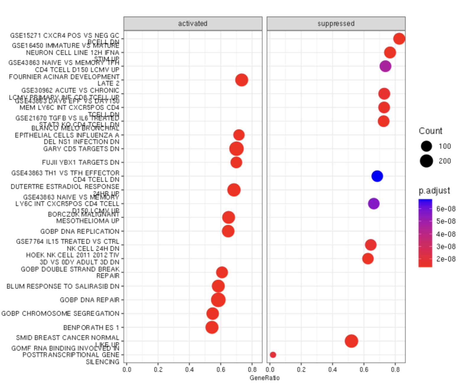
Dot Plot
All example visual images are from the 24 hour data.
Documentation: https://www.rdocumentation.org/packages/enrichplot/versions/1.13.1.994/topics/dotplot
adjust showCategory depending on how many categories you want to appear in your dotplot
require(DOSE)
dotplot(gse, showCategory=20, split=".sign", font.size = 8) + facet_grid(.~.sign)
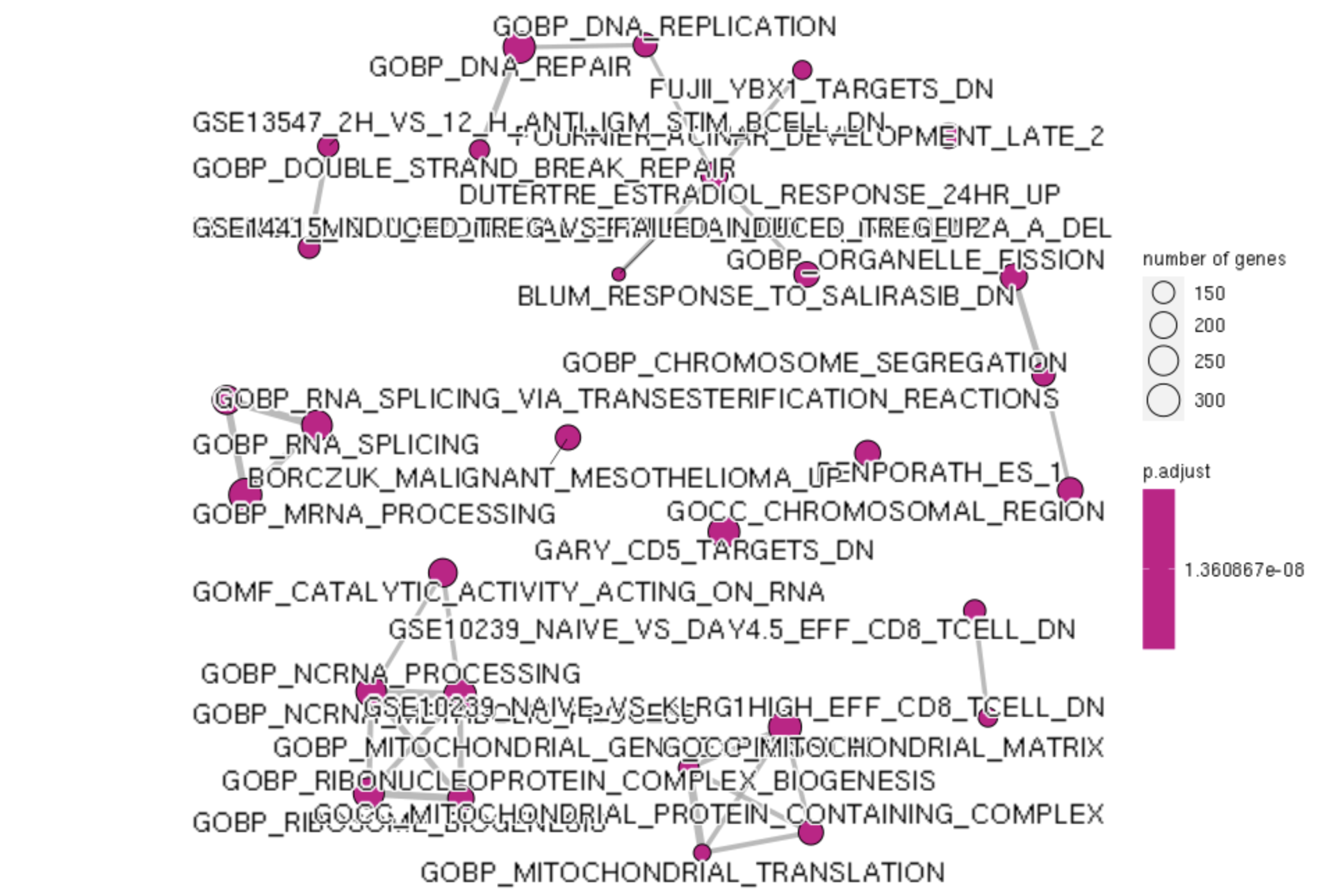
Enrichment Map
use pariwise_termsim to quiet errors
gse_emap_data <- pairwise_termsim(gse)
emapplot(gse_emap_data, showCategory = 50,edge.params = list(min = 0.2), cex.params = list(category_label = 0.5))
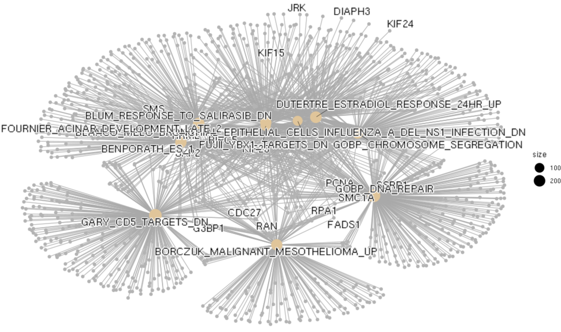
Category Netplot
categorySize can be either 'pvalue' or 'geneNum'
cnetplot(gse, categorySize="pvalue", color.params = list(foldChange = gene_list), showCategory = 10)
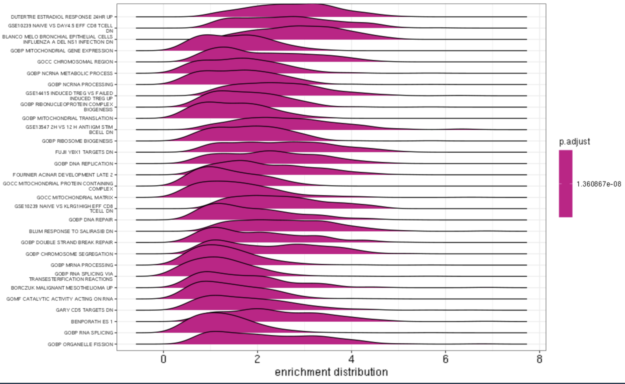
Ridge Plot
ridgeplot(gse, label_format = 40) +
  labs(x = "enrichment distribution") +
  theme(axis.text.y = element_text(size = 4))
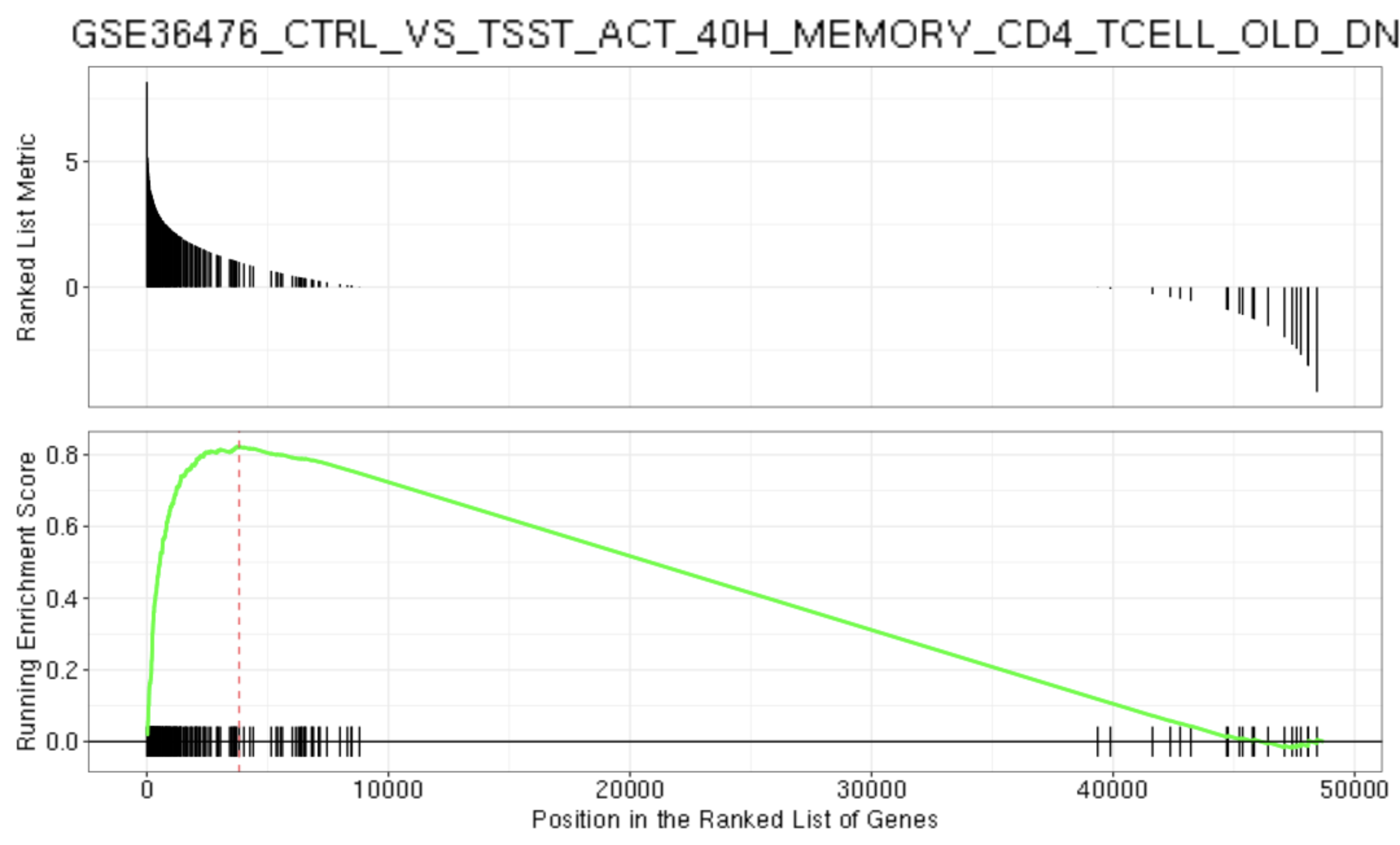
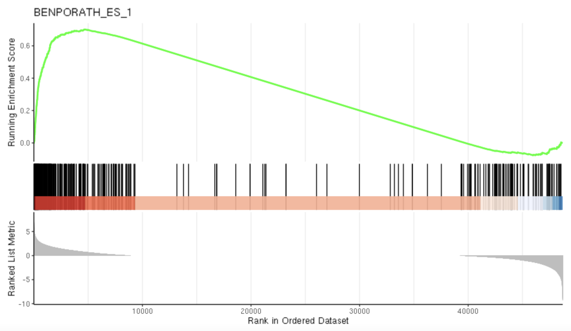
GSEA Plot
get geneSetID number from Excel sheet of output of gse (-1 for header) (i.e Hallmark, C7,etc) to input for
index for description and geneSetID
gseaplot(gse, by = "all", title = gse$Description[87], geneSetID = 87)
gseaplot2(gse, geneSetID = 1, title = gse$Description[1])
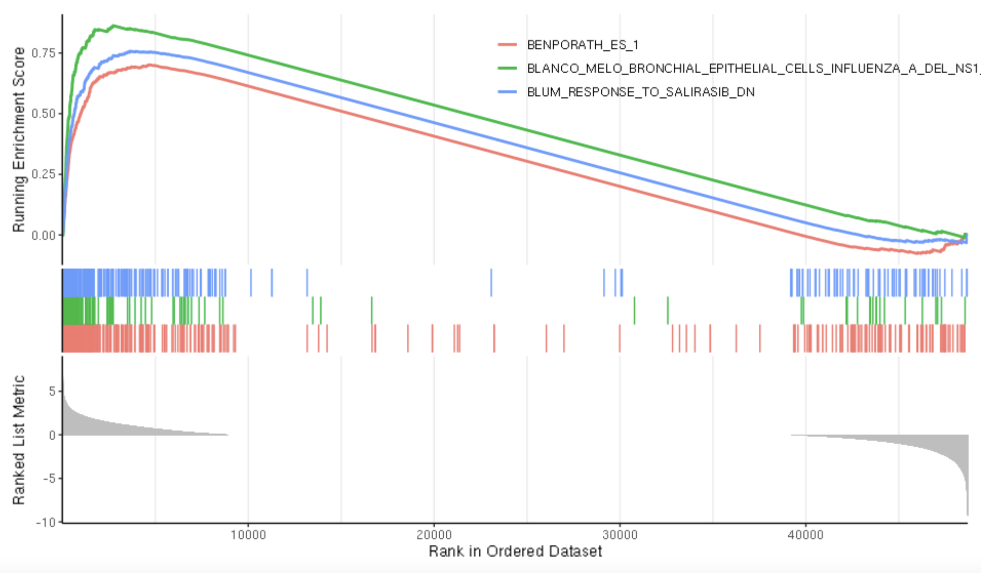
If you want to plot multiple gsea plots at a time adjust the number in geneSetID.
gseaplot2(gse, geneSetID = 1:3)
GSVA
Complete the above steps for all timepoints compared to the control, in our experiment we had naive 0 (naive), 24, 48, and 72 hour as timepoints, and used naive as the control time point so I ran the above section 3 times (naive vs 24, naive vs 48, naive vs 72).
results_24 <- read_csv("Fred_Hutch_R/24_data/log2_24_naive_R_GSEA_C7_custom_results.csv") %>%
                  #add column for time
                  mutate(time = "24") %>%
                  #select necessary column for visuals
                  select(ID,NES,time)
 results_48 <- read_csv("Fred_Hutch_R/48_data/log2_48_naive_R_GSEA_C7_custom_results.csv") %>%
                  #add column for time
                  mutate(time = "48") %>%
                  #select necessary column for visuals
                  select(ID,NES,time)
 results_72 <- read_csv("Fred_Hutch_R/72_data/log2_72_naive_R_GSEA_C7_custom_results.csv") %>%
                  #add column for time
                  mutate(time = "72") %>%
                  #select necessary column for visuals
                  select(ID,NES,time)
Top 10 genes (up and down regulated)
Sort by ascending order
asc_results_24 <- results_24[order(results_24$NES,decreasing = FALSE),]
asc_results_48 <- results_48[order(results_72$NES,decreasing = FALSE),]
asc_results_72 <- results_72[order(results_72$NES,decreasing = FALSE),]
Get top 10 down-regulated
top10down_24 <- slice(asc_results_24, 1:10) %>%
                  #add column for time
                  mutate(time = "24") %>%
                  #select necessary column for visuals
                  select(ID,NES,time)
top10down_48 <- slice(asc_results_48, 1:10) %>%
                  mutate(time = "48") %>%
                  select(ID,NES,time)
top10down_72 <- slice(asc_results_72, 1:10) %>%
                  mutate(time = "48") %>%
                  select(ID,NES,time)
Sort by descending order
desc_results_24 <- results_24[order(results_24$NES,decreasing = TRUE),]
desc_results_48 <- results_48[order(results_72$NES,decreasing = TRUE),]
desc_results_72 <- results_72[order(results_72$NES,decreasing = TRUE),]
Get top 10 up-regulated genes
top10up_24 <- slice(desc_results_24, 1:10)
top10up_48 <- slice(desc_results_48, 1:10)
top10up_72 <- slice(desc_results_72, 1:10)
Combine to get top 10 up and down regulated gene in 1 file
topdown <- rbind(top10down_24,top10down_48,top10down_72)
topup <- rbind(top10up_24,top10up_48,top10up_72)
top <- rbind(topdown,topup)
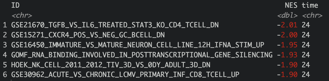
head(top)
#save as csv
write.csv(top, "/fh/fast/greenberg_p/user/kjhingan/GSEA_GSVA/GSVAtop.csv", row.names=FALSE)
Bar plot
Do this for each of the following 20 genes in the top 10 list: (I changed fill color to red brick for the downregulated genes)
Here we are finding the data row for each of the given 20 genes and creating an individual bar plot for each gene
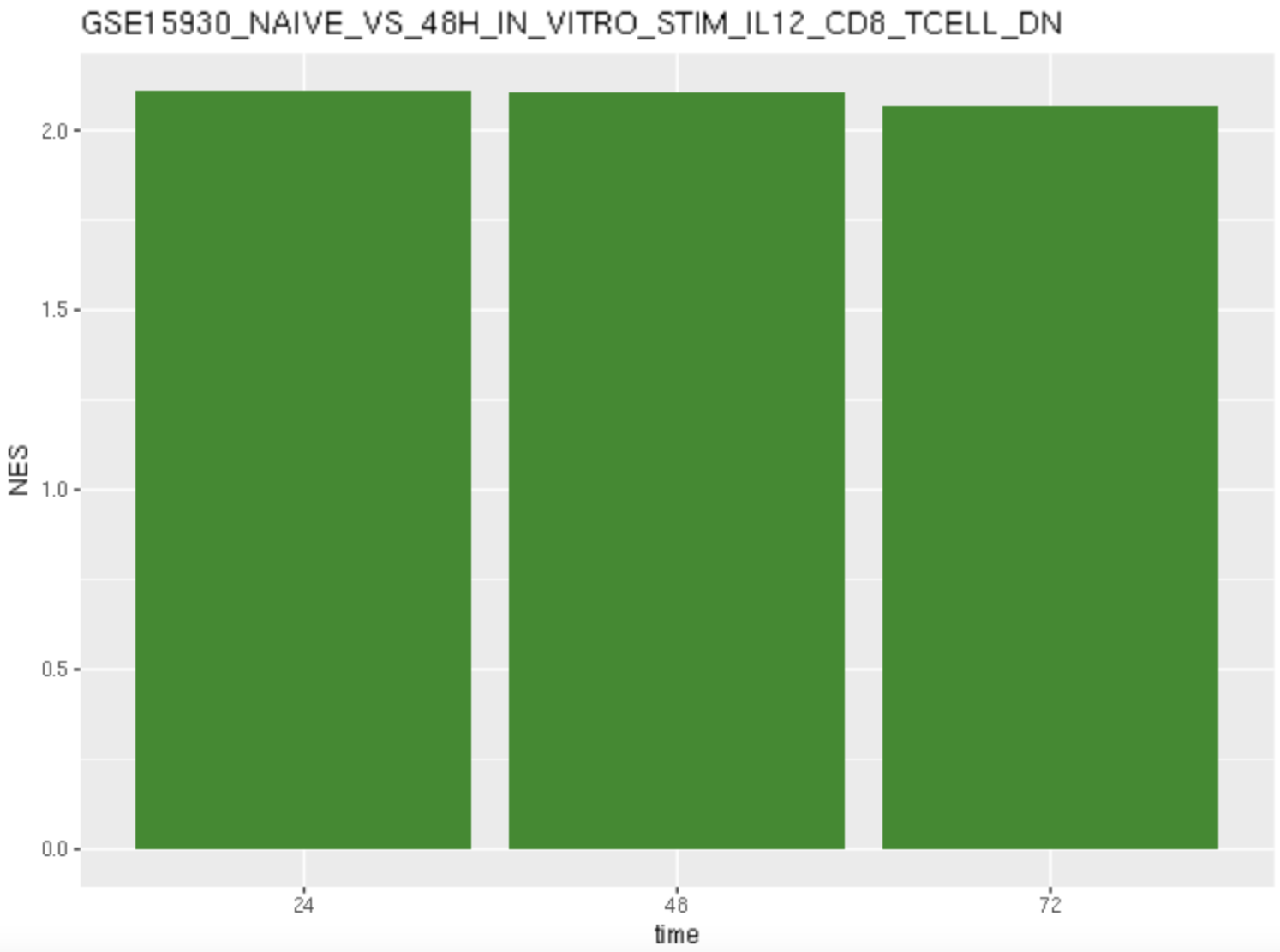
gene <- "GSE15930_NAIVE_VS_48H_IN_VITRO_STIM_IL12_CD8_TCELL_DN"
data24_1 <- filter(results_24, ID==gene)
data48_1 <- filter(results_48, ID==gene)
data72_1 <- filter(results_72, ID==gene)
data_1 <- rbind(data24_1,data48_1,data72_1)
head(data_1)

barplot <- ggplot(data_1,aes(x=time, y=NES))+
  geom_bar(stat="identity", fill = "forestgreen") +
  ggtitle(gene)
barplot

  # replace the file name with a name relevant to the gene (DN at the end of the file name represents down regulated and UP represents up-regulated)
ggsave(
  plot = barplot,
file.path("/fh/fast/greenberg_p/user/kjhingan/GSEA_GSVA/barplots/GSE15930_NAIVE_VS_48H_IN_VITRO_STIM_IL12_CD8_TCELL_DN.png")
)