SubCellBarCode: integrated workflow for robust spatial proteomics by mass spectrometry
Taner Arslan, Yanbo Pan, Georgios Mermelekas, Mattias Vesterlund, Lukas M. Orre, Janne Lehtiö


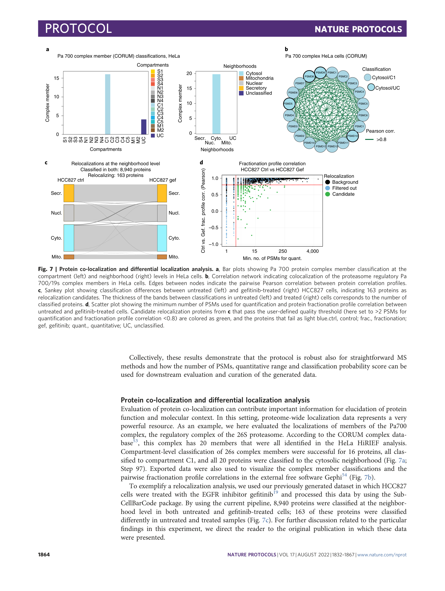


Extended
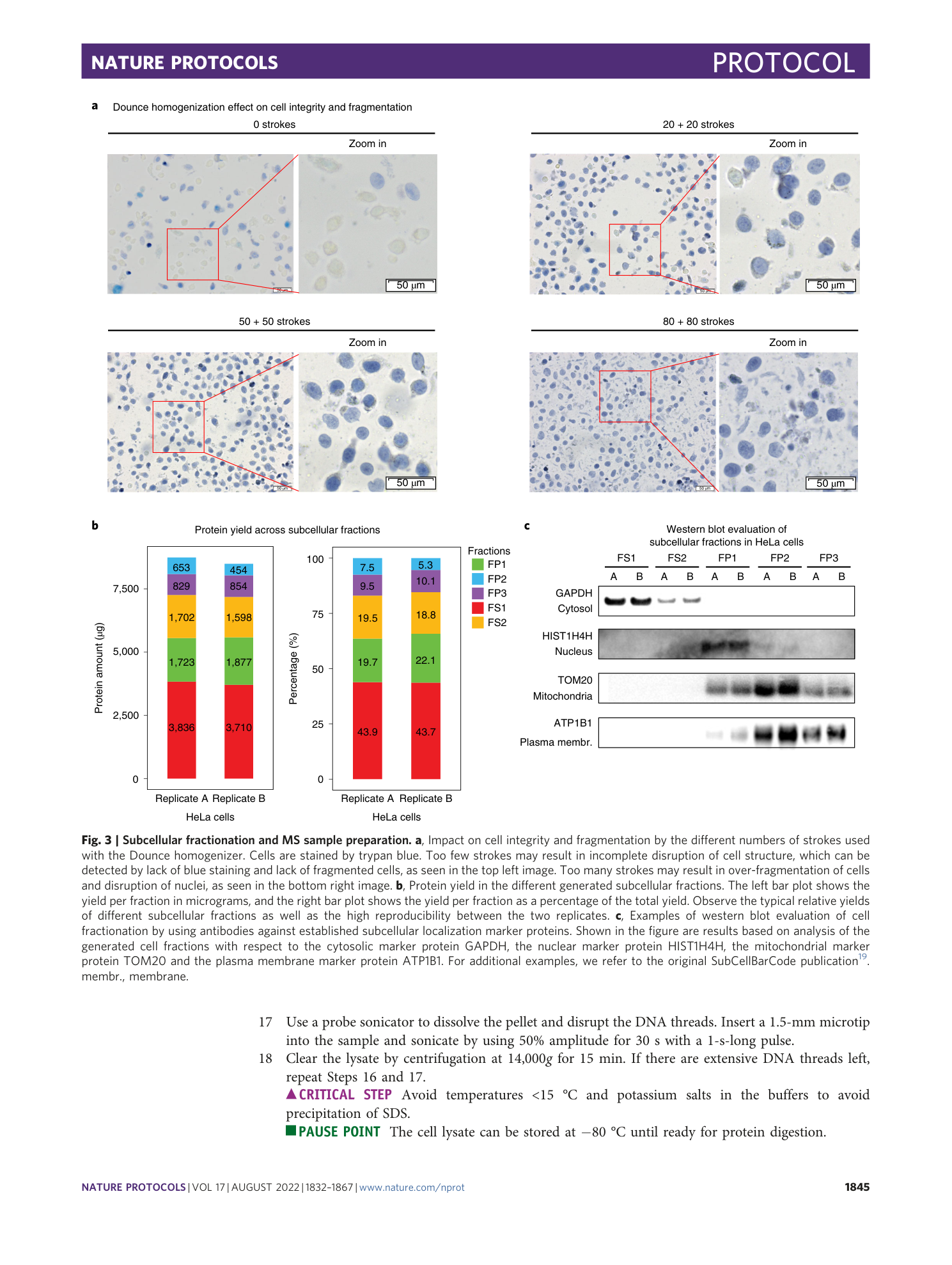
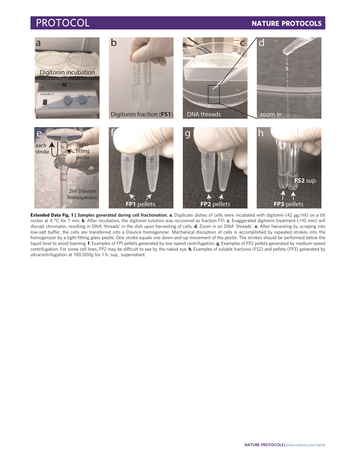
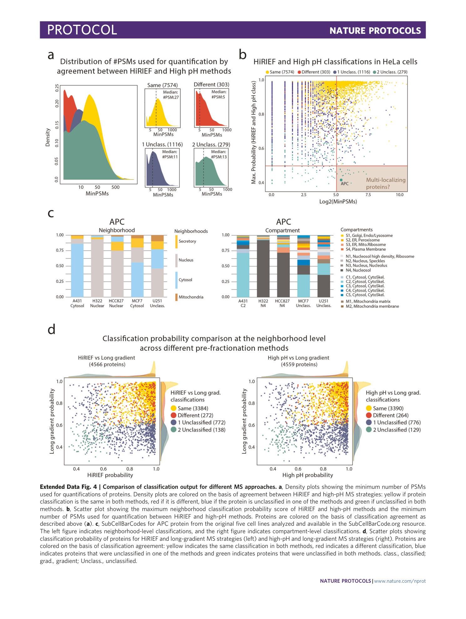
Extended Data Fig. 1 Samples generated during cell fractionation.
a , Duplicate dishes of cells were incubated with digitonin (42 μg/ml) on a tilt rocker at 4 °C for 7 min. b , After incubation, the digitonin solution was recovered as fraction FS1. c , Exaggerated digitonin treatment (>10 min) will disrupt chromatin, resulting in DNA ‘threads’ in the dish upon harvesting of cells. d , Zoom in on DNA ‘threads’. e , After harvesting by scraping into low-salt buffer, the cells are transferred into a Dounce homogenizer. Mechanical disruption of cells is accomplished by repeated strokes into the homogenizer by a tight-fitting glass pestle. One stroke equals one down-and-up movement of the pestle. The strokes should be performed below the liquid level to avoid foaming. f , Examples of FP1 pellets generated by low-speed centrifugation. g , Examples of FP2 pellets generated by medium-speed centrifugation. For some cell lines, FP2 may be difficult to see by the naked eye. h , Examples of soluble fractions (FS2) and pellets (FP3) generated by ultracentrifugation at 100,000 g for 1 h. sup., supernatant.
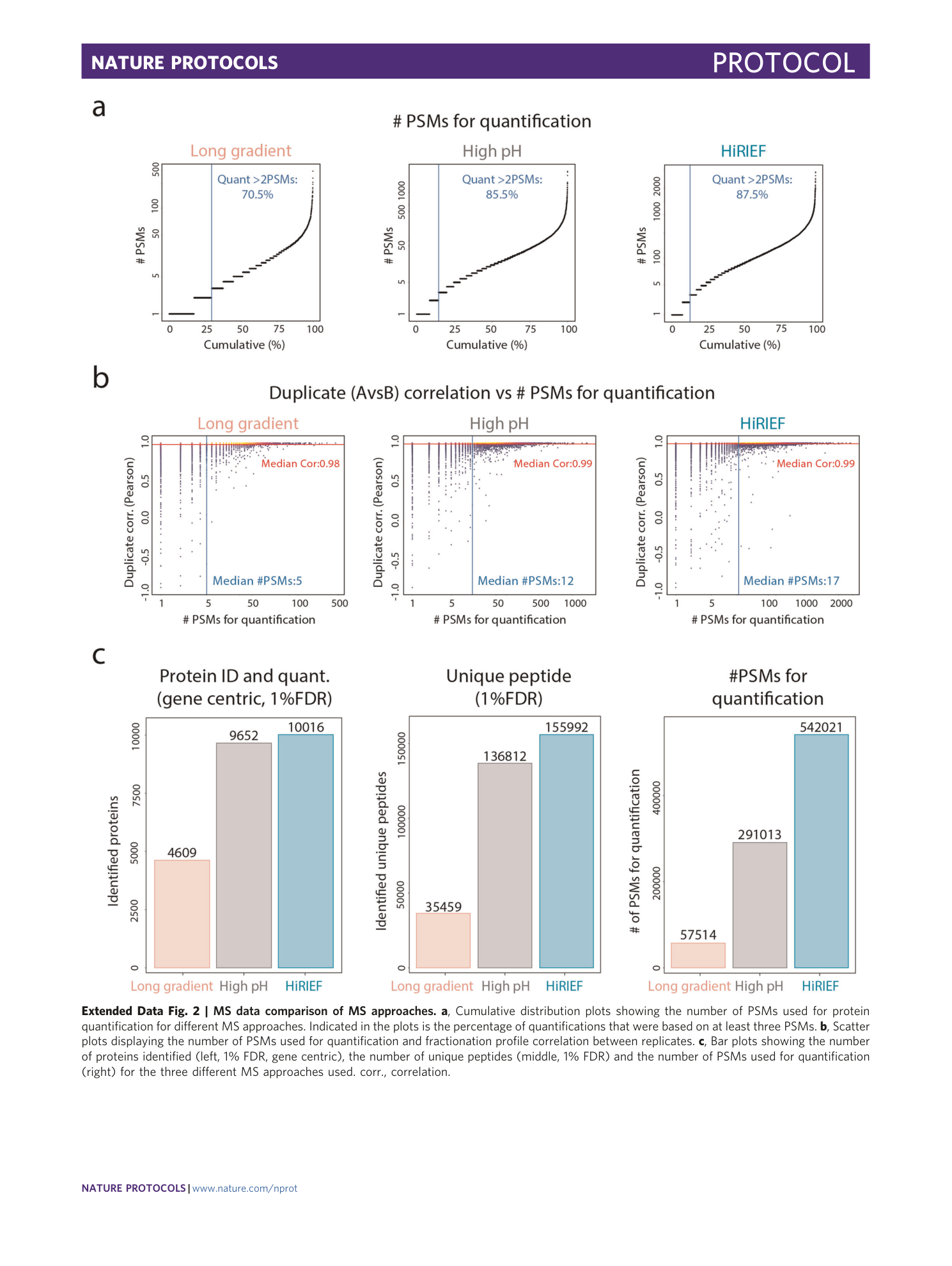
Extended Data Fig. 2 MS data comparison of MS approaches.
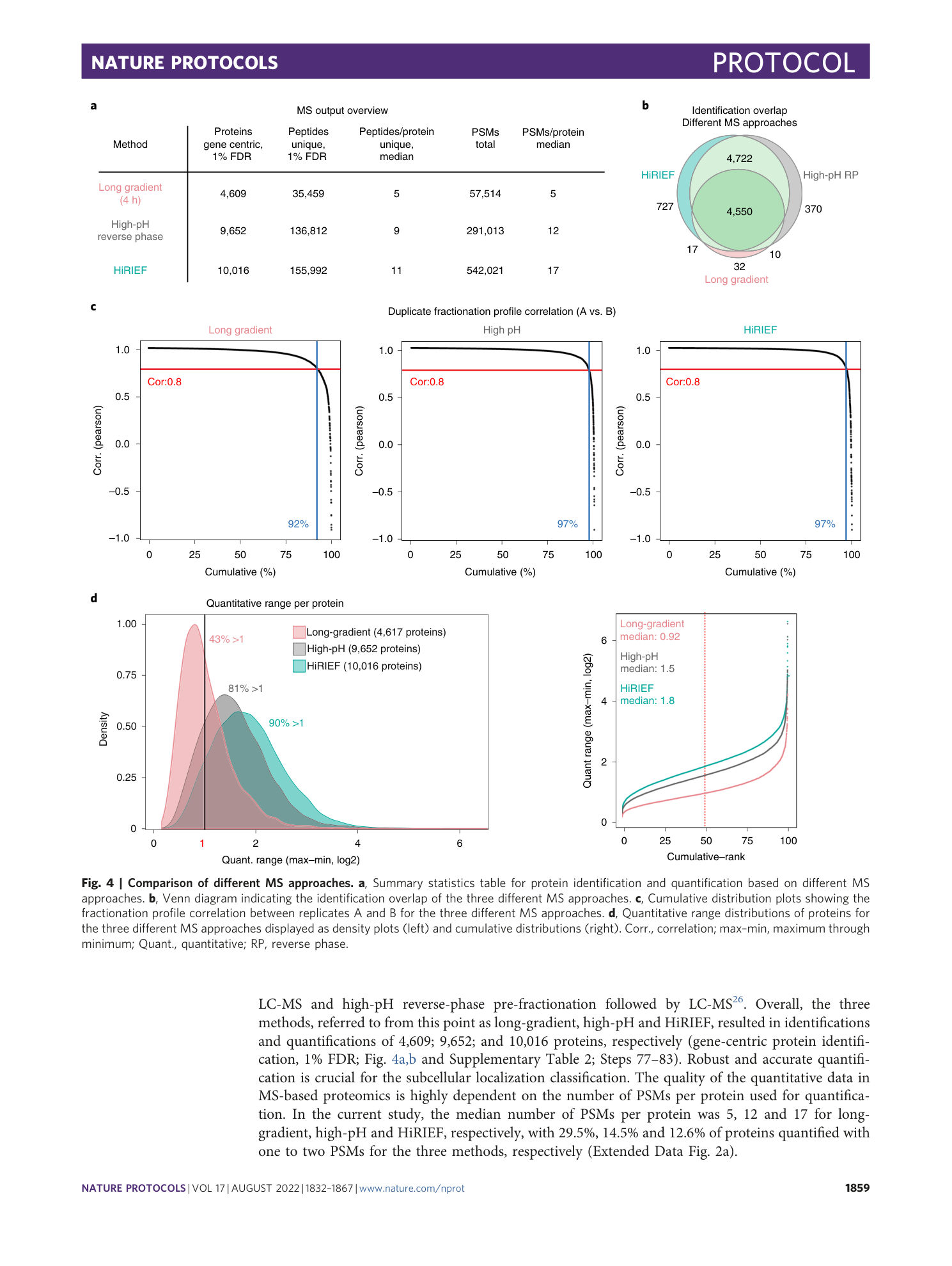
a , Cumulative distribution plots showing the number of PSMs used for protein quantification for different MS approaches. Indicated in the plots is the percentage of quantifications that were based on at least three PSMs. b , Scatter plots displaying the number of PSMs used for quantification and fractionation profile correlation between replicates. c , Bar plots showing the number of proteins identified (left, 1% FDR, gene centric), the number of unique peptides (middle, 1% FDR) and the number of PSMs used for quantification (right) for the three different MS approaches used. corr., correlation.
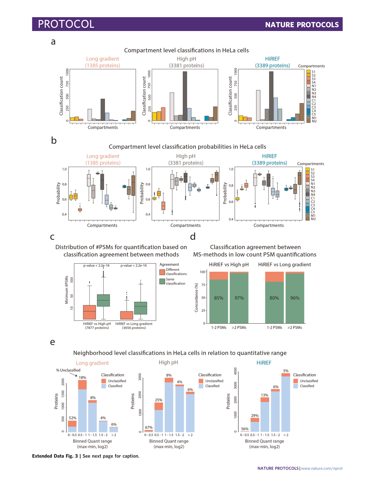
Extended Data Fig. 3 Classification output and MS method comparison.
a , Bar plots indicating the number of compartment classifications for the three different MS approaches used. b , Box plots displaying the classification probabilities for compartment-level classifications for the three different MS methods used. c , Box plots showing the minimum number of PSMs used for quantification of proteins on the basis of neighborhood classification agreement between HiRIEF and high-pH strategies (left) or HiRIEF and long-gradient strategies (right). Wilcoxon signed-rank test (two-sided) was used to calculate P values. d , Bar plots indicating the neighborhood classification agreement between methods for proteins quantified with one to two PSMs or more than two PSMs. e , Bar plots showing number of classifications and classification frequency of proteins binned by quantitative range (maximum value through minimum value in fractionation profile) for different MS approaches. Quantitative data are binned into five portions ranging between 0–0.5, 0.5–1, 1–1.5, 1.5–2 and >2. The elements of the boxplots in the figure are as follows: center line, median; box limits, upper and lower quartiles; whiskers, 1.5× interquartile range; points, outliers.
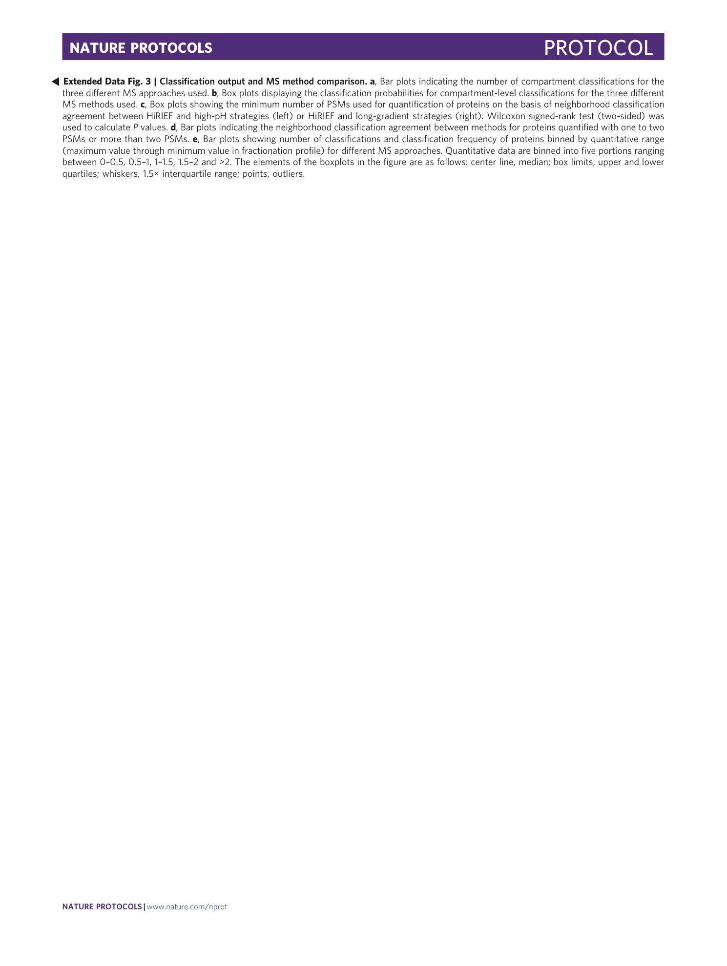
Extended Data Fig. 4 Comparison of classification output for different MS approaches.
a , Density plots showing the minimum number of PSMs used for quantifications of proteins. Density plots are colored on the basis of agreement between HiRIEF and high-pH MS strategies: yellow if protein classification is the same in both methods, red if it is different, blue if the protein is unclassified in one of the methods and green if unclassified in both methods. b , Scatter plot showing the maximum neighborhood classification probability score of HiRIEF and high-pH methods and the minimum number of PSMs used for quantification between HiRIEF and high-pH methods. Proteins are colored on the basis of classification agreement as described above ( a ). c , SubCellBarCodes for APC protein from the original five cell lines analyzed and available in the SubCellBarCode.org resource. The left figure indicates neighborhood-level classifications, and the right figure indicates compartment-level classifications. d , Scatter plots showing classification probability of proteins for HiRIEF and long-gradient MS strategies (left) and high-pH and long-gradient MS strategies (right). Proteins are colored on the basis of classification agreement: yellow indicates the same classification in both methods, red indicates a different classification, blue indicates proteins that were unclassified in one of the methods and green indicates proteins that were unclassified in both methods. class., classified; grad., gradient; Unclass., unclassified.
Supplementary information
Supplementary Information
Supplementary Method 1. BioConductor vignette for the SubCellBarCode R package
Reporting Summary
Supplementary Table 1
LC gradient lengths and strategy used for LC-MS analysis of the individual fractions (column A) generated by HiRIEF pre-fractionation in the pH ranges 3–10 (column B) and 3.4–4.8 (column C)
Supplementary Table 2
Relative quantitative data (TMT ratios) for the different MS datasets used in the current study. Data are represented in five different sheets: combined HiRIEF 3–10/3.4–4.8, HiRIEF 3–10, HiRIEF 3.4–4.8, high pH and long gradient. Each sheet includes the following columns: column A—gene symbol–centric protein ID, column B–L—TMT ratios for the five fractions (FS1, FS2 and FP1–3) in duplicate (A and B) and column M—minimum number of PSMs used for quantification for any of the 10 TMT channels
Supplementary Table 3
SubCellBarCode classification output for the different MS datasets used in the current study. Data are represented in five different sheets; combined HiRIEF 3–10/3.4–4.8, HiRIEF 3–10, HiRIEF 3.4–4.8, high pH and long gradient. Each sheet includes the following columns: column A—gene symbol–centric protein ID, column B—final neighborhood classification (SVMoutput), column C—final compartment classification (SVMoutput), columns D–G—SVM-derived probabilities for the individual neighborhoods and columns H–V—SVM-derived probabilities for the individual compartments