Perseus: A Bioinformatics Platform for Integrative Analysis of Proteomics Data in Cancer Research
Juergen Cox, Stefka Tyanova
Abstract
Mass spectrometry-based proteomics is a continuously growing field marked by technological and methodological improvements. Cancer proteomics is aimed at pursuing goals such as accurate diagnosis, patient stratification, and biomarker discovery, relying on the richness of information of quantitative proteome profiles. Translating these high-dimensional data into biological findings of clinical importance necessitates the use of robust and powerful computational tools and methods. In this chapter, we provide a detailed description of standard analysis steps for a clinical proteomics dataset performed in Perseus, a software for functional analysis of large-scale quantitative omics data.
Before start
Introduction
High-resolution mass spectrometry-based proteomics, aided by computational sciences, is continuously pushing the boundaries of systems biology. Obtaining highly accurate quantitative proteomes on a genome-wide scale is becoming feasible within realistic measurement times [1]. Similar to the clinical goals of genomics and transcriptomics to provide a deeper understanding of a certain disease that goes beyond the standard clinical parameters of cancer diagnosis, proteomics offers a comprehensive view of the molecular players in a cell at a particular moment and in a specific state [1]. The maturation of the technology together with the development of suitable methods for quantification of human tissue proteomes [2,3,4] has opened new doors for employing proteomics in medical applications and is shaping the growing field of clinical proteomics [5,6]. Following these advances, proteomic approaches have been used to address multiple clinical questions in the context of various cancer types. The major area of application is the profiling of cancer-relevant tissues—including the proteomes of colorectal cancer [7,8] and prostate cancer [9], as well as the subtyping of lymphoma [10] and breast cancer [11,12] patients. Although proteomics has become an extremely powerful approach for studying biomedical questions, offering unique advantages compared to other omics techniques, the functional interpretation of the vast amounts of data of a typical proteomics experiment often poses analytical challenges to the biological domain experts.
The aim of data analysis is to translate large amounts of proteomic data that cover numerous samples, conditions and time points into structured, domain-specific knowledge that can guide clinical decisions (Fig.1). Prior to any statistical analysis, data cleansing is usually performed which includes normalization, to ensure that different samples are comparable, and missing value handling to enable the use of methods that require all data points to be present. A plethora of imputation methods developed for microarray data [13] can be applied to proteomics as well [14]. Among these, methods with the underlying assumption that missing values result from protein expression that lies under the detection limit of modern mass spectrometers are frequently used. A typical task of clinical proteomics studies is to identify proteins that show differential expression between healthy and diseased states or between different subtypes of a disease. Although commonly established statistical methods, which achieve this task exist, distinguishing between expression differences due to technical variability, genetic heterogeneity, or even intra-sample variability and true disease-related changes require deep knowledge of statistical tools and good understanding of the underlying problems in the analysis of omics data.
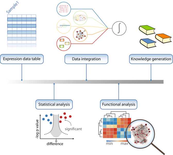
For instance, testing thousands of proteins for differential expression is hampered by the multiple hypothesis-testing problem, which results in an increased probability of calling a protein a significant hit when there is no actual difference in expression. This necessitates the use of correction methods to increase the confidence of the identified hits. The choice of the appropriate correction method depends on the balance between wrongly accepted hits (error type I) and wrongly rejected hits (error type II) that an experimentalist is willing to accept. For instance, permutation-based FDR [15] has a reduced error type II rate compared to the Benjamini-Hochberg correction [16]. Once the initial list of quantified proteins is narrowed down to only the significantly changing hits the question of their functional relevance arises. Enrichment analysis of protein annotations is the preferred method for deriving functional implications of sets of proteins and is applicable to both categorical (Fisher’s exact test [17]) and expression/numerical data (1D enrichment test [18]). The outcome of such an analysis often offers a comprehensive view of the biological roles of the selected proteins through highlighting key pathways and cellular processes in which they are involved.
In this chapter, we provide a step-by-step workflow of bioinformatic analysis of proteomics data of luminal-type breast cancer progression. Commonly used analytical practices are described including data cleansing and preprocessing, exploratory analysis, statistical methods and guidelines, as well as functional enrichment techniques. All the steps are implemented as processes in Perseus [19], a comprehensive software for functional analysis of omics data.
Attachments
Steps
The Methods section contains several modules covering the most frequently performed steps in the analysis of proteomics data. Often, a proteomics study benefits from a global overview of the data, which usually includes the total number of identified and quantified proteins, dynamic range, coverage of specific pathways, and groups of proteins. A good practice in data analysis is to start with exploratory statistics in order to check for biases in the data, undesirable outliers, and experiments with poor quality data and to make sure that all requirements for performing the subsequent statistical tests are met. Once the data are filtered and normalized appropriately, statistical and bioinformatic analyses are performed in order to identify proteins that are likely to be functionally-important. When the list of such proteins is small enough and direct links to the question of interest can be inferred using prior knowledge, follow-up experiments can be performed after this step to confirm the results of the statistical analysis. However, one of the advantages of mass spectrometry-based proteomics is the ability to unravel new discoveries in an unbiased way, for instance, through functional analysis. This analysis is often based on enrichment tests, which can highlight guiding biological processes and mechanisms.
3.1 Loading the Data
Go to the “Load” section in Perseus and click the “Generic matrix upload” button.
In the pop-up window, navigate to the file to be loaded.
Select all the expression columns and transfer them to the Main columns window. Select all additional numerical data that may be needed in the analysis and transfer them to the Numerical columns window. Make sure that the columns containing identifiers (e.g., protein IDs) are selected as Text columns. Click ok.
3.2 Summary Statistics
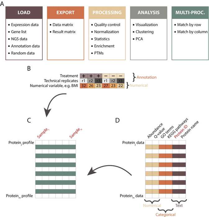
In the workflow panel, change the name of the data matrix from matrix 1 to InitialData by right-clicking the node and changing the Alternative name box. Close the pop-up window. Explore the right-most panel of Perseus, which contains useful information such as number of main columns and number of rows.
Go to “Processing ➔ Filter rows ➔ Filter rows based on categorical column” to exclude proteins identified by site, matching to the reverse database or contaminants.
Transform the data to a logarithmic scale by going to “Processing ➔ Basic ➔ Transform” and specifying the transformation function (e.g., log2( x )).
In the “Processing” section, select the “Basic” menu and click on the “Summary statistics (columns)” button. Select all expression columns by transferring them to the right-hand side. Click ok and explore the new matrix.
3.3 Filtering
Use the workflow window to select the InitialData matrix data by clicking on it ( see Note 5 5).
In the “Processing” section, go to the “Filter rows” menu and select “Filter rows based on valid values.” Change the Min. valids parameter to Percentage and keep the default value of 70% for the Min. percentage of values parameter. Click ok . Check how many protein groups were retained after the filtering.
3.4 Exploratory Analysis
To visually inspect the data, go to “Analysis ➔ Visualization ➔ Histograms.” Select all the samples of interest by transferring them to the right-hand side. Click ok .
Explore the visualization options in the Histogram panel by testing the functionality of each of the buttons (e.g., Properties, Fit width, Fit height ).
Click on the pdf button to export the plot.
Switch the view to the “Data” tab.
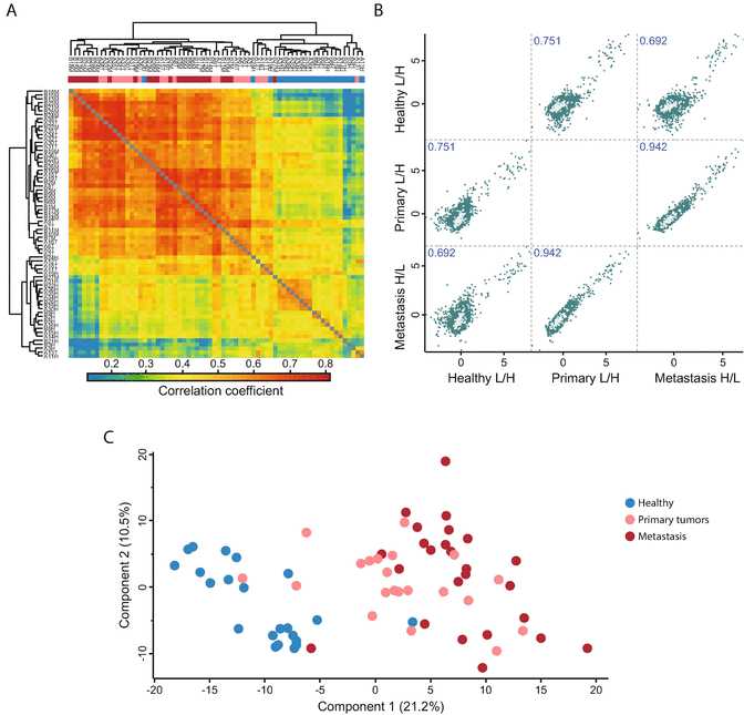
Go to “Analysis ➔ Visualization ➔ Multi scatter plot.” Select the desired samples by transferring them to the right-hand side. Click ok ( see Fig.3).
Adjust the plot using the Fit width and Fit height options and resizing the plot window.
In the drop-down menu “Display in plots” in the plot window, select Pearson correlation .
Select a scatter plot by clicking on it. The selected plot will be shown in an enlarged view.
Select a number of proteins from the “Point” table on the right of the multi scatter plot and examine their position in all pairwise sample comparisons.
Switch back to the “Data” tab to continue with the analysis.
“Go to Processing ➔ Basic ➔ Column correlation.” Make sure that the Type is set to Pearson correlation . The output table contains all pairwise correlations between the selected columns.
To visualize the sample correlations, go to “Analysis ➔ Clustering/PCA ➔ Hierarchical clustering.” Use the Change color gradient to set a continuous gradient similar to the one in Fig.3a.
Export the plot by clicking on the pdf button.
Navigate back to the previous data matrix by clicking on it in the workflow panel.
Principal component analysis requires all values to be valid. To remove all protein groups with missing values, repeat Section 3.3, step 2 setting the percentage parameter to 100 .
Go to “Analysis ➔ Clustering/PCA ➔ Principal component analysis” and click ok . Explore the sample separation (dot plot in the upper panel) and the corresponding loadings (dot plot in the lower panel).
In the table on the right of the PCA plot, select a set of samples (e.g., all samples that belong to one experimental condition) and change their color by clicking on the Symbol color button and selecting the desired color.
Check the contribution of other components by substituting Component 1 and 2 with other components from the drop-down menu. Find the components that show sample separation according to the experimental conditions ( see Fig.3c).
Explore the proteins driving this separation. In the loadings plot beneath the PCA, change the selection Mode to rectangular selection . Hold the left mouse key down and draw a rectangle around the dots in the upper right corner and then release the mouse. The selected proteins are highlighted in the table to the right and their labels are displayed in the plot.
3.5 Normalization
Navigate back to the data matrix before filtering for 100% valid values (Section 3.3, step 2 ).
Go to “Processing ➔ Normalization ➔ Z-score.” Change the Matrix access parameter to Columns and select the Use median option. In the new data table, plot histograms for the same subset of samples as in Section 3.4, step 1 .
3.6 Experimental Design
Go to “Processing ➔ Annot. rows ➔ Categorical annotation rows.” Use the Create action option to manually specify the experimental condition to which a sample belongs (i.e., indicate control versus stimulus, or different stages of a disease). All the samples belonging to one condition should have the same annotation. A new row will be added under the column names in the newly generated data matrix.
3.7 Loading Annotations
Go to the drop-down menu indicated with a white arrow at the top left corner of Perseus and select “Annotation download.”
Click on the link in the pop-up window. Select the appropriate annotation file (e.g., “PerseusAnnotaion ➔ FrequentlyUsed ➔ mainAnnot.homo_sapiens.txt.gz,” if the organism of interest is homo sapiens).
Download the file to the Perseus/conf/annotations folder.
Go to “Processing ➔ Annot. columns ➔ Add annotation.” Select the file from the previous step as a Source.
Set the UniProt column parameter to the column that contains UniProt identifiers. These identifiers will be used for overlaying the annotation data with the expression matrix (e.g., Protein IDs).
Select several categories of interest to be overlaid with the main matrix and move them to the right-hand side. Click ok.
3.8 Differential Expression Analysis
Go to “Processing ➔ Tests.” From the menu select the appropriate test. For the data set used in this chapter, the Multiple-sample tests option should be chosen, as there are more than two conditions that are compared. The default parameters do not have to be changed.
Specify the categorical row that contains information about the experimental conditions of the samples that will be used in the differential analysis in the Grouping parameter.
Keep the default value of 0 for the S0 parameter, to use the standard t-test statistic. Change the parameter to use the modified test statistic approach described by Tusher et al. [15].
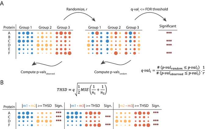
Select the multiple hypothesis testing correction method to be used by specifying the Use for truncation parameter ( see Note below and Fig.4a).
Specify if a suffix should be added to the output columns produced by Perseus. This option is relevant when multiple tests are conducted, e.g., with different parameter settings, as it helps to distinguish between them in the output table.
Inspect the output table. It contains three new columns: ANOVA significant , −Log ANOVA p-value, and ANOVA q-value .
Go to “Processing ➔ Filter rows ➔ Filter rows based on categorical column.” Set the Column parameter to ANOVA Significant and the Mode parameter to Keep matching rows to retain all differentially expressed proteins.
Go to “Processing ➔ Tests ➔ Post-hoc tests.” Set the Grouping parameter to the same grouping that was used for the ANOVA test ( see Section 3.6 , step 1 ) and the FDR to the desired threshold. Tukey’s honestly significant difference (THSD) is computed for all proteins and all pairwise comparisons and the significant hits within the corresponding pairs are marked ( see Note below and Fig.4b).
3.9 Clustering and Profile Plots
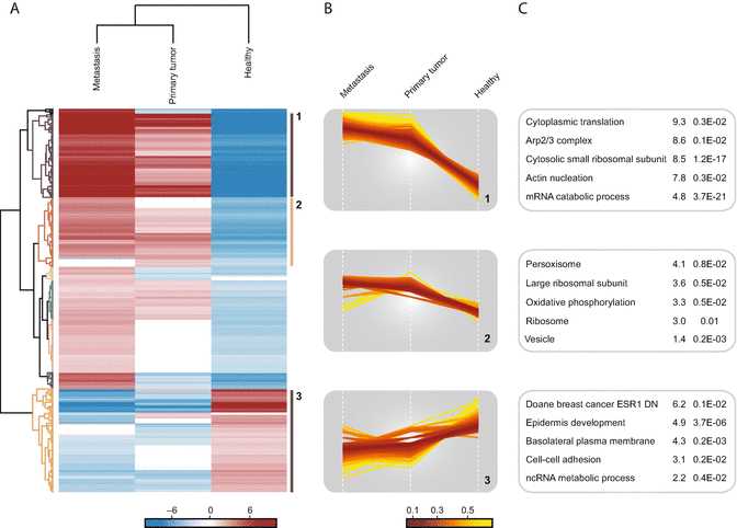
Go to “Analysis ➔ Clustering/PCA ➔ Hierarchical clustering.” Keep the default parameters and click ok .
Inspect the resulting heatmap and the relationship between the groups and the proteins.
Click on the Change color gradient button in the button ribbon above the heatmap to examine the color scale usage (red means high and green low expression) and to modify them.
Click on several node junctions in the protein tree that represent potentially interesting clusters of proteins (i.e., upregulation in a certain experimental condition). The selected clusters are highlighted and appear in the “Row clusters” table displayed to the right of the heatmap.
Inspect the different profile plots as you navigate through the different clusters in the table. Change the color by modifying the Color scale and export the profile plots by clicking on the Export image button ( see Fig.5).
From the ribbon menu in the heat map view, click on the Export row clustering button to add the cluster information to a new data matrix.
3.10 Functional Analysis
Go to “Multi-proc. ➔ Matching rows by name.” Both Base and Other matrices point to the last matrix.
Click on Base matrix and then in the workflow window select the data matrix that was generated before filtering for ANOVA significant hits (Section 3.9, step 6 ).
In the pop-up window set Matching column in matrix 1 and 2 to a common identifier (e.g., Protein IDs) .
In the categorical columns section, transfer the category Cluster to the right hand-side. Click ok .
Go to “Processing ➔ Annot. columns ➔ Fisher exact test.” Change the Column parameter to Cluster and click ok . The resulting table contains information about all annotation categories that were found to be significantly enriched or depleted using a Fisher’s exact test and multiple hypotheses correction.

